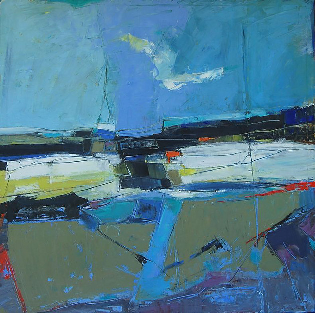
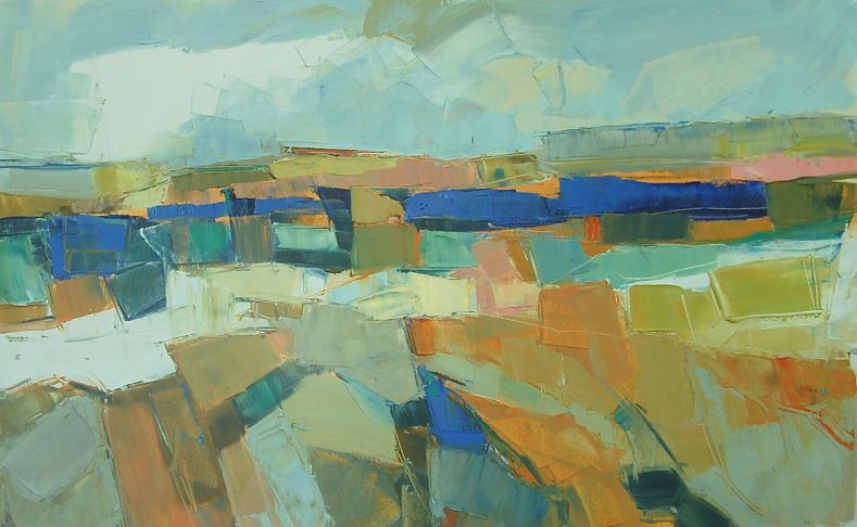
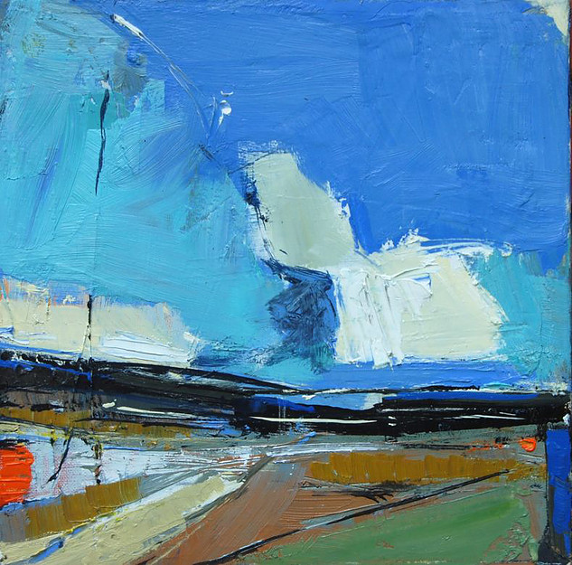
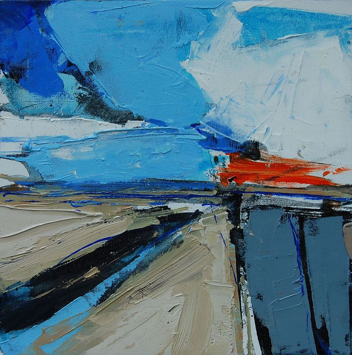
After the fall

It’s been a while, two years since I last posted on this site. Hopefully, we’re on the path out of a pseudo populism that was never about real populism but more about how to bulk up the stock market and pretend to appease the working class, who hasn’t made any real strides forward since the 1990s. Both sides bought the lie. I’ve been doing more reading than painting this year. As I began writing this, the woman who has the ability to “ascertain” the formal transition process for President-elect Biden, finally agreed to do so. That’s something I hadn’t ever paid attention to before. It’s all about the transfer of money to the new administration.

I’ve read moving and inspirational journals from artists working outside their inner city studios since this plague began. Many from blogs that I follow, other creative outpourings from Art Papers, published here in Atlanta. Lucky is the artist having a city studio and a country hideout – or a residency. And although the art world has done its share for inclusion this year, I doubt much will change for the average person, no matter their race, color or gender. We still have housing affordability issues and rampaging development with a loss of tree canopy that threatens to exacerbate stormwater issues like runoff and flooding here in metro Atlanta, and across the country. As environmental activists, we encourage local officials to strengthen tree ordinances, with increased pervious surface percentages. However, pushing that through also requires a larger civic involvement; tenacious pressure that has to be ongoing. Everything ends up being political.

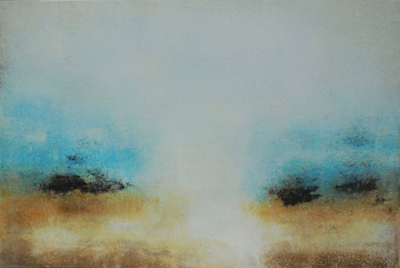
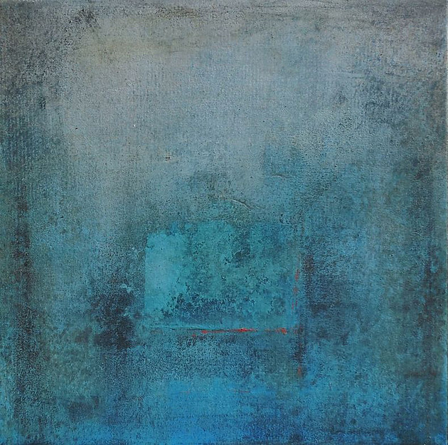
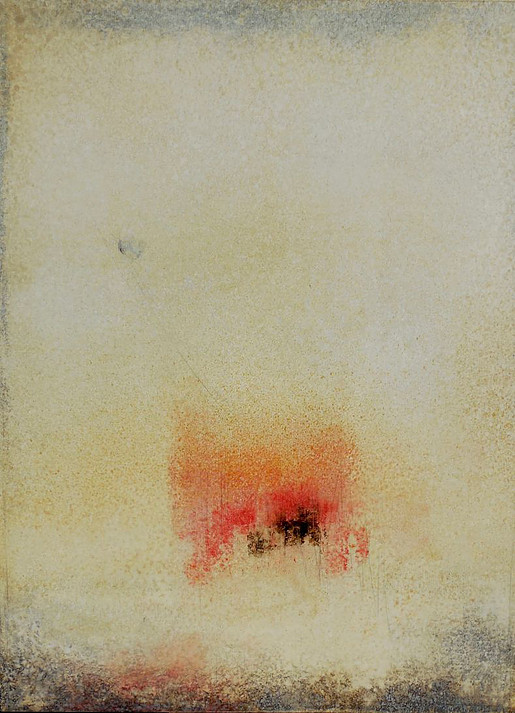
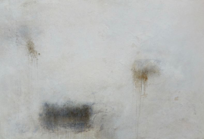
I continue to paint, but my work has always been informed by a focus on place and how the natural world is often sidelined, especially in a large and thriving city. Right now I’m distracted by the election process as well as trying to survive the pandemic. I’ve been trying to figure out where this election went wrong, even though my side has ostensibly won. Populism as a descriptor of our current situation has flipped from its origins as a farmers’ collective, as this provocative C-Span podcast with author Thomas Frank & right wing journalist Chris Caldwall discuss during the National Book Festival this September. Eric Deggans is the moderator who keeps things on track.

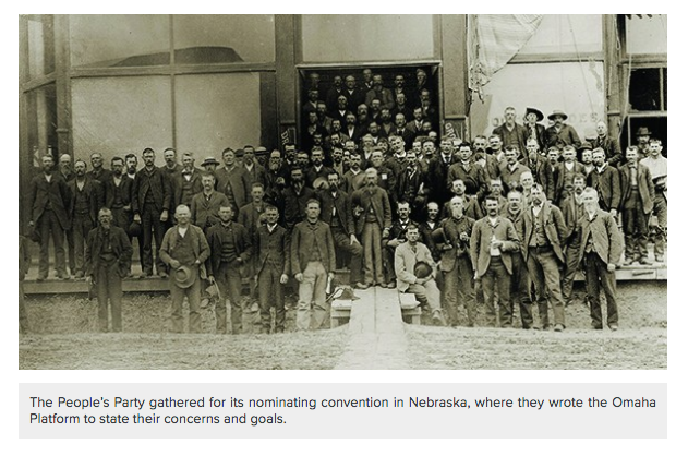
As the Kansas Historical Society suggests, during the 1880s to 1890s “The Farmers’ Alliance movement was growing in the South and Midwest. The group promoted higher prices for produce and felt that the government’s responsibility was to represent farmers rather than big business. In their view, railroads, banks, and other businesses received more support from government.

Photo courtesy Lumen Learning

Soybean, dairy and pig farmers who voted for Trump in 2016 thought he’d have their backs as he blithely promised in his ‘America First’ mantra during his campaign, echoing The People’s Party similar complaints about their government in the late 1800s. Instead, Trump’s tariffs on China backfired. Farmers have suffered greatly during this administration, even as smaller farms were on the brink of failure before his tenure. This NY Times article from June outlines the decline due to the badly timed tariffs; “Overall sales of American farm goods to China remained deeply depressed, dropping to $9.3 billion in 2018 from $19.6 billion in 2017 as the trade war escalated, before picking up to about $14 billion last year.”

Why does the working class keep voting against their own interests? And more to the point, what did they see in the failed businessman Trump? I think they overlooked his failures and merely bought the showman. Last year a friend gave me Hate, Inc. by journalist Matt Taibbi, which makes an excellent point about the chasm between those who voted for DT and the rest of us. Because he notes these two as better than the rest of the professional pundits, I recently bought a couple of Thomas Frank’s books. I also dug up the article that Taibbi mentions that professor Joan C. Williams published in the Harvard Business Review back in 2016 a month after those election results. Williams is the founding director of the Center for WorkLife Law at the University of California’s Hastings College of the Law. Her newest book is White Working Class: Overcoming Class Cluelessness in America. An excerpt from the Harvard Business Review piece states the following:

Michèle Lamont, in The Dignity of Working Men, also found resentment of professionals — but not of the rich. “[I] can’t knock anyone for succeeding,” a laborer told her. “There’s a lot of people out there who are wealthy and I’m sure they worked darned hard for every cent they have,” chimed in a receiving clerk. Why the difference? For one thing, most blue-collar workers have little direct contact with the rich outside of Lifestyles of the Rich and Famous. But professionals order them around every day. The dream is not to become upper-middle-class, with its different food, family, and friendship patterns; the dream is to live in your own class milieu, where you feel comfortable — just with more money. “The main thing is to be independent and give your own orders and not have to take them from anybody else,” a machine operator told Lamont. Owning one’s own business — that’s the goal. That’s another part of Trump’s appeal.

Robin Leach, host of Lifestyles of the Rich and Famous, syndicated from 1984-1995

So maybe that partially answers why the man was able to steal his first election. But the issue of 70 million mostly white voters still believing in him for a second run speaks more to continuing racial issues in the country than anything else.
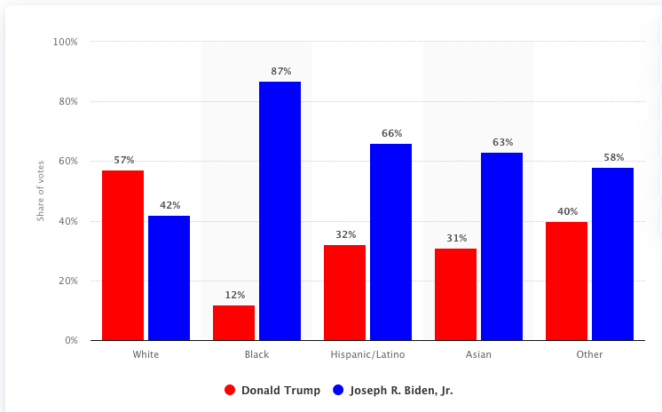
Graph courtesy Statista.com

It’s almost unbelievable but not quite, that the state of Georgia could be responsible for handing the Senate back to the Democratic Party. When my ex-husband and I decided to move back from Canada to the states in the summer of 1976, I researched which cities had the most likely future growth and chose Atlanta. He left soon afterwards, but the city has never disappointed.

After having been involved for the last decade with my community and local government here, much of which has included a crash course on zoning and urban planning, I’ve realized that the African American contingent, and especially women of color, is what makes Atlanta and environs such a unique place to live. This demographic comes out swinging to protect their neighborhoods from over-development and they value the health of our environment.

Women taking the lead in progressive movements is nothing new, throughout history we’ve been at the front lines. I met Medea Benjamin in San Francisco at the outset of the Iraq War, protesting with her band of Code Pink activists and engaging in all sorts of civil disobedience. She’s still at it, fighting for justice and human rights.

The 8th year anniversary of the invasion of Iraq: “Then we went to the White House to do a photo up with umbrellas that spelled out BRING OUR WAR $$ HOME”

Organizers all over the world have known for centuries that the masses hold the most power; disobedience and civil resistance works. Marching in the streets is most effective combined with strategic objectives. It helps to know one’s elected officials to be able to call on them during crises. Even on the local level, developing a good relationship with one’s county commissioner or city councilwoman can be critical and make the difference in keeping bad developers beyond the gates.

This week’s New Yorker has a great article mostly focused on Erica Chenoweth, the political scientist and professor of public policy at the Harvard Kennedy School and the Radcliffe Institute for Advanced Study. Some valuable excerpts:
“The study of civil resistance… is in large part the study of how movements can win “defections”—how they can turn obedient subjects of the regime into allies of the disobedient majority.
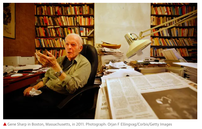
In 1973, the political scientist Gene Sharp published “The Politics of Nonviolent Action” …In the sixteenth century, Iroquois women won political rights within their tribe through a coördinated succession of actions: refraining from sex and childbirth, striking when it came time to harvest crops, refusing to make moccasins for male soldiers. In the Iranian Revolution of 1979, some of the most decisive gains against the Shah came from acts of bureaucratic slow-walking, and from employees at nationalized oil fields working at half speed. In the American imagination, an uprising looks like a throng. In the Sharpian tradition, the winning combination of tactics may look like an absence—or, to the untrained eye, like nothing at all.

While mostly male friends were anguishing about blood running in the streets or increased violence after an election that didn’t mollify the Proud Boys and their ilk, I kept thinking about historical wins by ‘the people’ against tyranny. So many of us forget that our individual power to affect change can be a reality – and en masse, it’s amplified. If the internet and social media has garnered eyes and the cable/tv/streaming industry has made monied stickiness its motivating force, the forgotten message is to harness the power of the masses to make our officials accountable. Activists know this without having data but having it helps.


In 2011, Chenoweth and Stephan published their findings in a book called “Why Civil Resistance Works: The Strategic Logic of Nonviolent Conflict.” It included detailed narrative case studies in which the authors hypothesized about why, say, the Philippine People Power movement of 1986 achieved its goals whereas the Burmese uprising of 1988 did not. (In Burma, activists over-relied on “methods of concentration, such as election rallies and protests,” leaving themselves vulnerable to state repression. The movement in the Philippines alternated rallies with strikes and boycotts; it also drew the participation of a wide array of civil-society leaders, including clergy and teachers, many of whom eventually turned against the regime.)


In September of 2000, Slobodan Milosevic, who had been the dictator of Serbia for more than a decade, attempted to falsify election results in order to stay in power. In response, a student-led movement called Otpor coördinated a variety of tactics—highway blockades, subversive street theatre, a coal miners’ strike. The resistance was widely perceived as nonviolent and legitimate, and it grew quickly, gaining support among Serbs of every age and from all parts of the country. A Serbian policeman, ordered to shoot into a crowd of protesters, held his fire; he later told journalists that, given the cross-section of people present, he couldn’t rule out the possibility that one of them was his child. By early October, Milosevic had no choice but to leave office.”
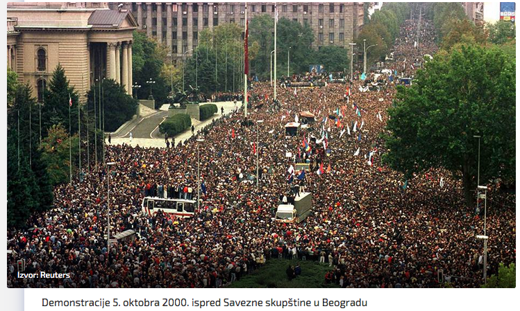
It appears now that Mr. Trump will have no choice but to concede, whether he does that directly or indirectly by leaving office. 2021 will be a good year.

Posted in Uncategorized | Leave a comment

SEEK ATL and Cosmo Whyte

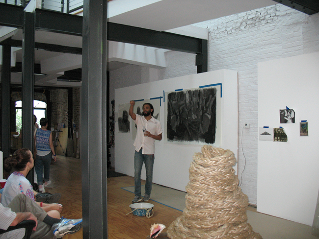
Saturday’s SEEK ATL artist studio tour featured Cosmo Whyte’s fantastic studio space downtown, in the Castleberry Hill Arts District. Whyte, born in Jamaica, has widely exhibited in a short period of time and is the recipient of many awards, including the 2018 MOCA GA Working Artist Project (WAP) fellowship grant. He currently teaches art at Morehouse College in Atlanta. SEEK and MOCA GA teamed up this year to visit all three of the current WAP recipients’ studios.

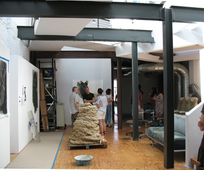
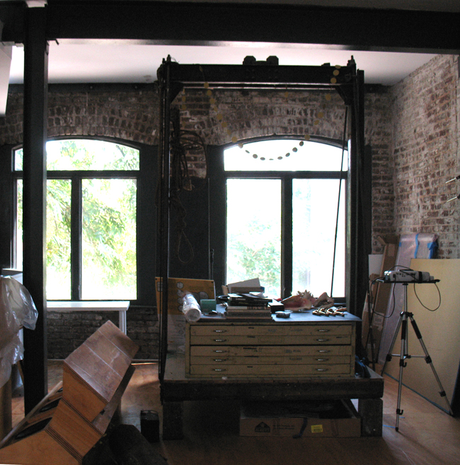
Another older industrial building renovated and put to good use, the downstairs is being divided up into two smaller front spaces, while Cosmo has the use of the large space beyond with the original floor to ceiling windows. I believe he also uses the upper level as a live/work area. My truncated notes from his talk were taken on a scrap of paper, having forgotten my usual notebook.

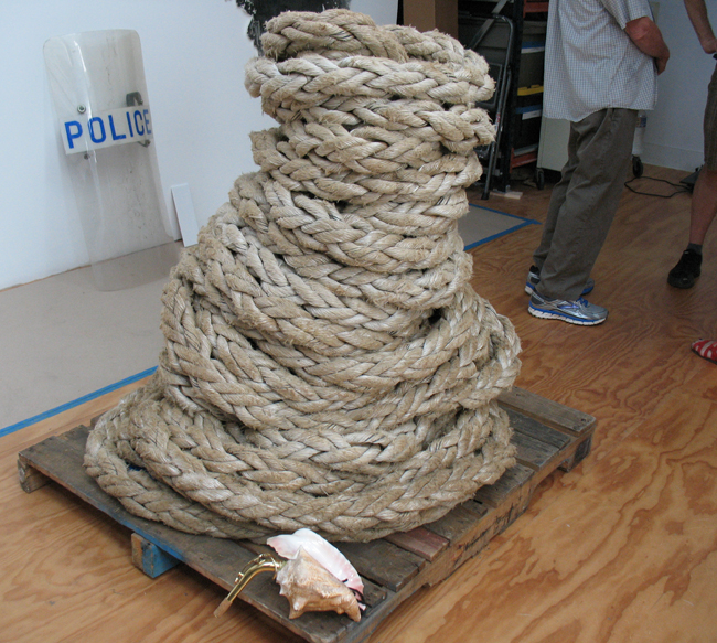
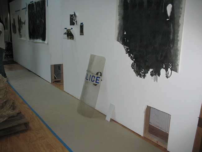
While most of the work currently on view in his studio is unfinished, Whyte is experimenting with various mediums, including braided shipping rope that he purchases off eBay, along with a plexi-glass police shield. The rope is now curled into a large cylinder placed on a wooden pallet, and echoes the braided hair in many of Whyte’s drawings.

Ships are what brought the slave-trade to the Americas, rope bound those ships to port and often, the slaves together. A large conch shell sits next to the rope on the pallet. The issue of migration may be at play, whether or not it was forced.

The historic Hatchelling House website states that before the mechanized process was in place, “semi-skilled artisans combed the raw hemp fibre across hatchels, boards with long iron pins to straighten out the fibres before they were spun into yarn. Whale oil, known as ‘train oil’ was used to lubricate the fibres. This was very hard manual work that took great strength…In 1864 the hatchelling operation was mechanised and incorporated in the new Spinning Room built above the Hemp Houses. The hatchellers’ role was passed over to women to work as machine minders following the pattern set in northern textile mills.”

Other ideas for future pieces include Whyte’s plans to laser cut plexiglass, possibly in braille, with snippets of sheet music from “A Ballad for Americans”, an operatic folk cantata originally sung by Paul Robeson during FDR’s 1940 campaign against Wendell Wilkie. As a fan of vocal music and of Robeson, I had to do more research.

One line of the cantata reads: “I’m just an Irish, Negro, Jewish, Italian, French and English, Spanish, Russian, Chinese, Polish, Scotch, Hungarian, Swedish, Finnish, Canadian, Greek and Turk and Czech and double-Czech American.”  The song was sung at various political conventions in 1940, including both the Communist and Republican conventions, and it endured through World War II, when African American soldiers performed the work in a benefit concert at London’s Royal Albert Hall. It has been periodically revived, during the United States Bicentennial (1976). There is also a well-known recording by civil rights activist and singer Odetta, recorded at Carnegie Hall in 1960. A Wiki link offers more references.

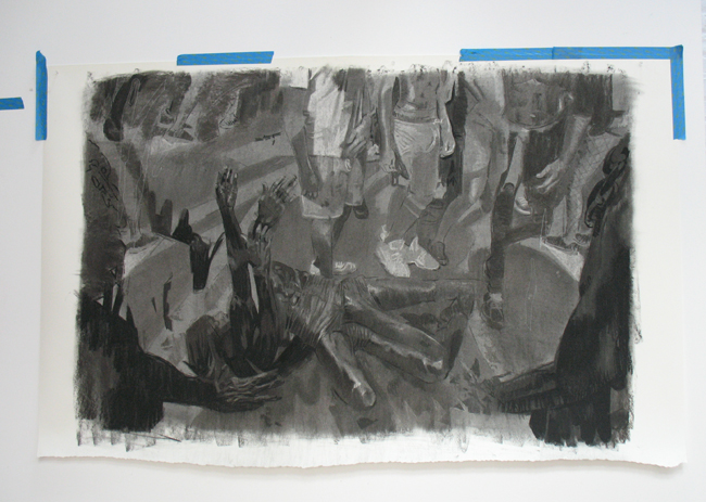
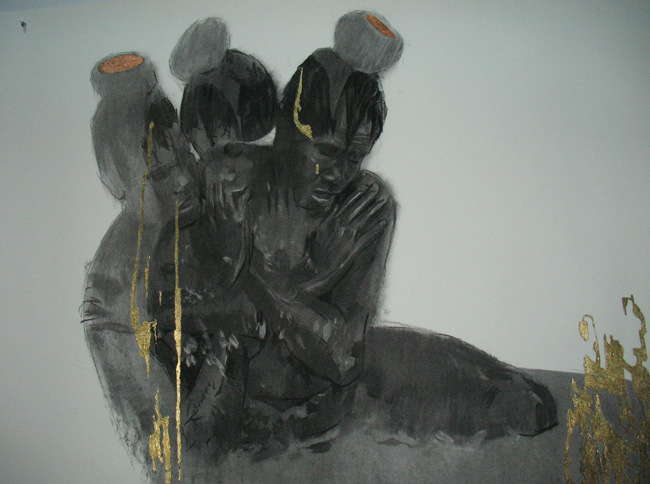
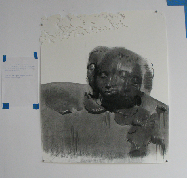
In a couple of large charcoal drawings on heavy paper, Whyte depicts participants covered with motor oil in the Jouvert street festival that many Caribbean islands celebrate. One part of the tradition involves smearing paint, mud or oil on the bodies of participants known as “Jab Jabs”, in order to render them invisible or unrecognizable. Whyte said that he wanted to investigate a plantation narrative, with immigrants’ expression of place or placelessness. “Carnival was introduced to Trinidad by French settlers in 1783, a time of slavery. Banned from the masquerade balls of the French, the enslaved people would stage their own mini-carnivals in their backyards — using their own rituals and folklore, but also imitating and sometimes mocking their masters’ behavior at the masquerade balls.”

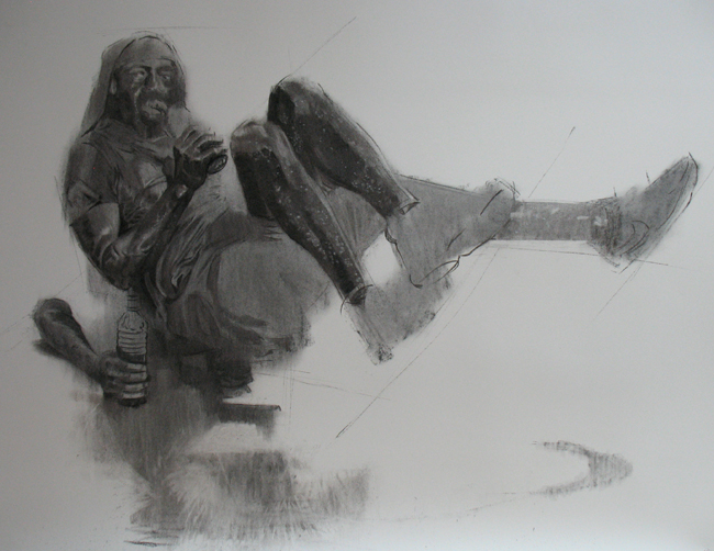
Security and police presence at these festivals has added another dimension, which may evoke memories of enslavement and/or loss of freedom. Whyte’s said that his depiction of multi-limbed characters is linked to Anansi, the spider trickster of the Ashanti and other Akan-speaking tribes of West Africa, specifically Ghana.

The character is considered to be the spirit of all knowledge of stories, and often the creator of the world. “Anansi is the hero and trickster of an enormous body of West African folktales. Africans had a deep appreciation of mental keenness, as well as sympathy and admiration for those who used their wits to extract themselves from difficult situations. Those who outwitted opponents were respected more than those who outfought them. Cleverness was a trait much revered in African folktales (Ollivier 1994). Hence, Anansi was popular as a small but clever trickster who often outwitted larger opponents.”

Whyte scrapes, sands and cuts away both the edges and main areas some of his work, layering photographic images underneath the cutaway portions. Some of the paper’s edges have a filigree from his cutting away that is reminiscent of lace, which reminds this viewer of the history of women’s work in the textile industry. Lacemaking, long an occupation for upper class women, was a step up for most women during the late 1500s and 1600s, after an Amsterdam town council ordained in 1529 that poor orphan girls would be allowed to make a living from lacework.

Heads may be obscured by braided hair or dreadlocks, features erased or obliterated completely in some of the portraits. He works both from life and from photographs. The result of obvious painstaking work, these figurative abstracted pieces are both powerful and elegant, a tough act to achieve.

Whyte mentioned being interested in the Jamaican scholar Stuart Hall’s writings on transcending nationalism, an aspect that his work seems to address. In the late 1980s, Hall presented a series of lectures called “Cultural Studies”. As this 2017 New Yorker article states, ‘…Hall became fascinated with theories of “reception”—how we decode the different messages that culture is telling us, how culture helps us choose our own identities. He wasn’t merely interested in interpreting new forms, such as film or television, using the tools that scholars had previously brought to bear on literature. He was interested in understanding the various political, economic, or social forces that converged in these media. It wasn’t merely the content or the language of the nightly news, or middlebrow magazines, that told us what to think; it was also how they were structured, packaged, and distributed.

“People have to have a language to speak about where they are and what other possible futures are available to them,” he observed…’

Cosmo will participate in The Drawing Center’s Open Sessions 2018-2020 program.

Artist and writer Deanna Sirlin’s review of Whyte’s 2017 exhibit at Marcia Wood gallery can be found here.

SEEK’s next studio visit with be with painter Alan Loehle on Nov. 10th, my 2012 interview with him can be found here.

My history of Pillowtex, an early artists’ space in the same area and now converted to lofts, can be found here.

Posted in Art reviews, criticism and blogs, Interviews | Tagged , , , , , , , | Leave a comment

Sammy Peters at Mason Fine Art, Atlanta

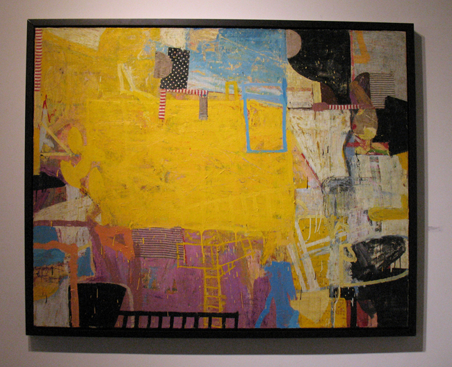
I finally had a chance to chat at length with the prolific painter Sammy Peters, at the February Group Exhibition which opened on Feb. 22nd at Mason Fine Art and Events. His lovely wife was gracious enough to allow me unfettered access, while I peppered him with questions about his process and his work. Peters has shown in Atlanta before, with the Lowe Gallery, the Alan Avery Gallery and now at Mark Mason Karelson’s new location on Plasters Ave. From Little Rock, Arkansas, the artist still lives there and works in a huge space that his father used for his sign printing business.

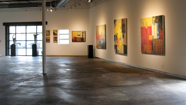
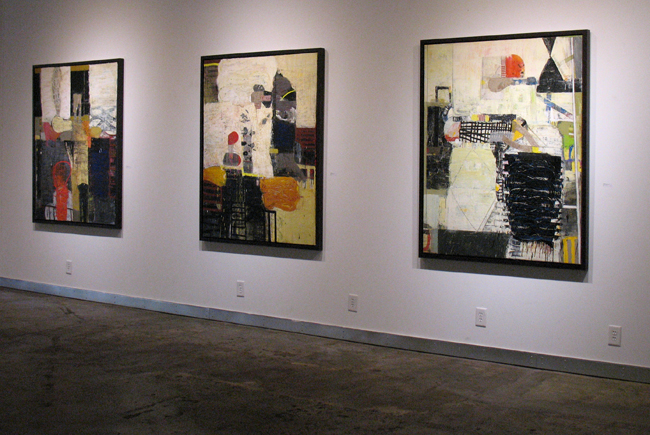
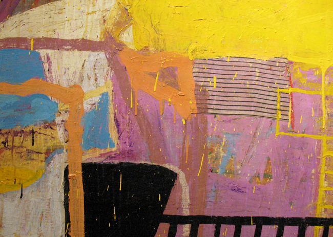
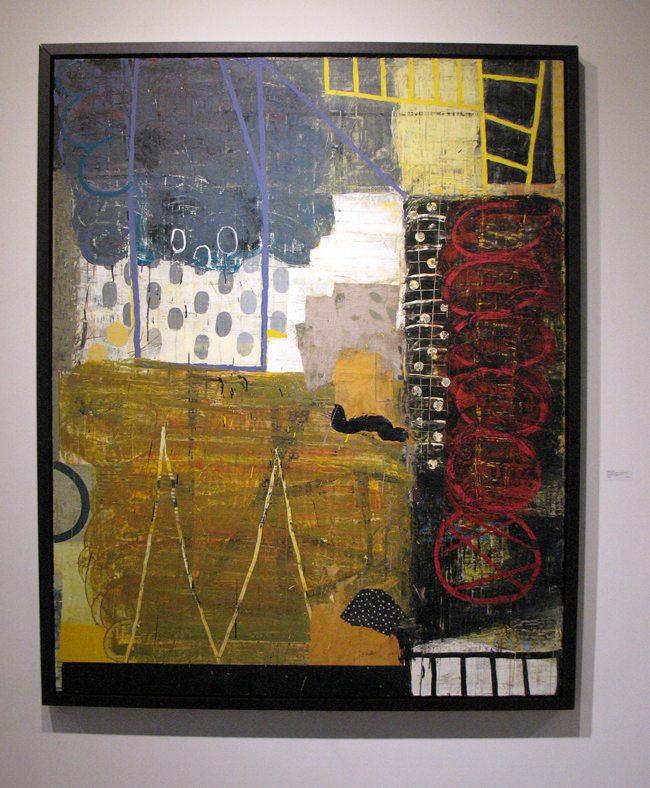
The paintings that fill one large gallery space in the current exhibit date from 2011 to 2018, a majority are from 2017 and from the first few months of 2018. In these works as in his previous paintings, fabric and paper are used as collage layers, often painted over. Peters enjoys utilizing stripes, checks and patterns in his work, adding texture and a degree of structure to his gestural swipes and drips. I had conducted a 2013 interview via email with Peters for my blog, and although we talked for some time at this recent opening, the reluctance to demystify his process remains intact.

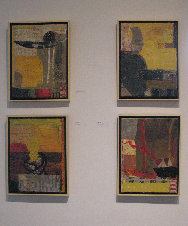
Four small paintings from 2017 were hung together, 16 in x 12 in.

Verbalization of a visual medium can be counter productive. As with music, a good painting should hit us emotionally, and language – for all its strengths – can never completely describe or explain either sensory perception. It helps to have some knowledge of theory, both in color and music – otherwise one might be tempted to label much abstract work “incoherent”, as one friend naively and unjustly claimed. Coherence and communication are terms strictly attuned to branding and advertising; the message that sells a product. Since when does any art have to communicate and elucidate unless we talk about illustrations framing a narrative? And don’t get me started on music. Does anyone in their right mind demand that Sonny Rollins explain what the hell he’s doing by going off on those extraneous sax tangents? Another jazz musician may understand the progressions, but for the most part, the audience is inadequately prepared to verbally explain the titan’s “sound-making”.

Again, language is over-rated in these spheres and especially when it comes to trying to define an artist like Peters. His work remains tantalizingly and sublimely obscure. Even his titles seem to purposefully throw one off the trail; “Essence: inseparable; illusion”, “Tentative: underlying; spaces”, “Declaration: evolving; artifacts” – you get the picture.

The critic Peter Frank in his 2001 essay on Peters’ work remarks, The pleasure provided the viewer by the facture, by its conditional but emphatic sensuosity and the harmony of elements it proposes, in turn effects a kind of invitation, a persuasion of the eye back into the thornier dialectical challenges….Still, however more concrete the imagery has become, it remains fluid as opposed to fixed, coalescent as opposed to truly coherent.”

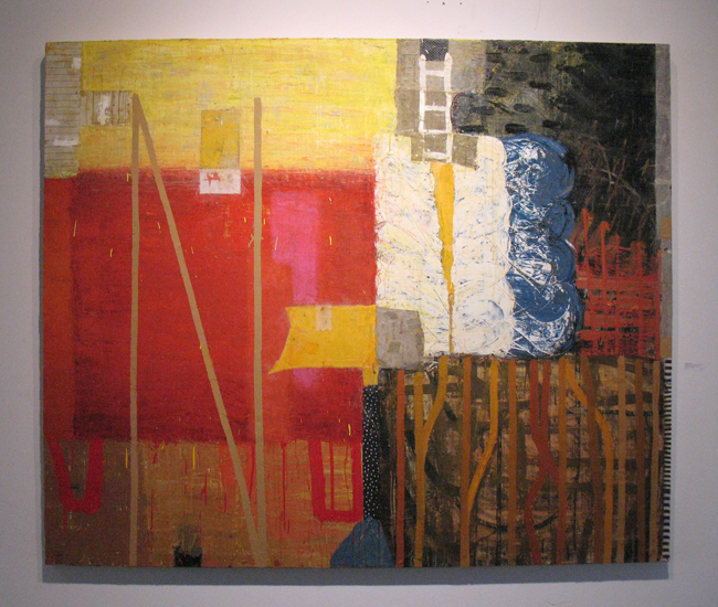
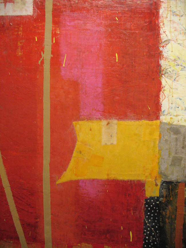
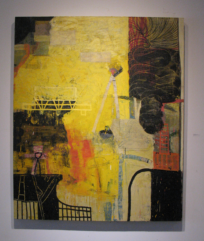
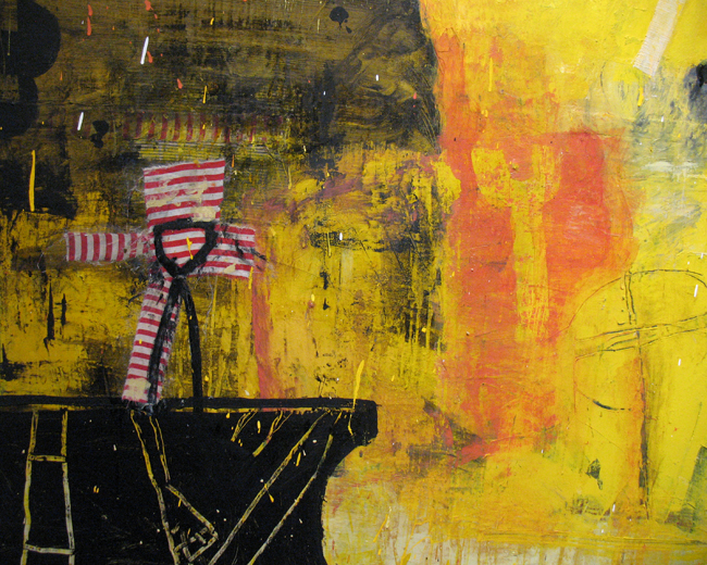
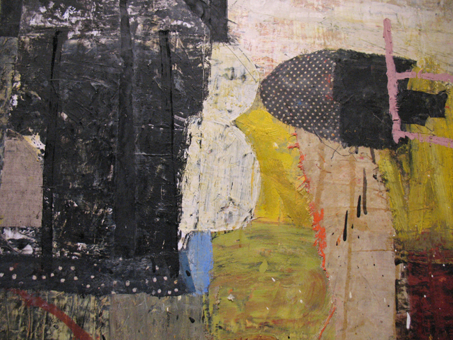
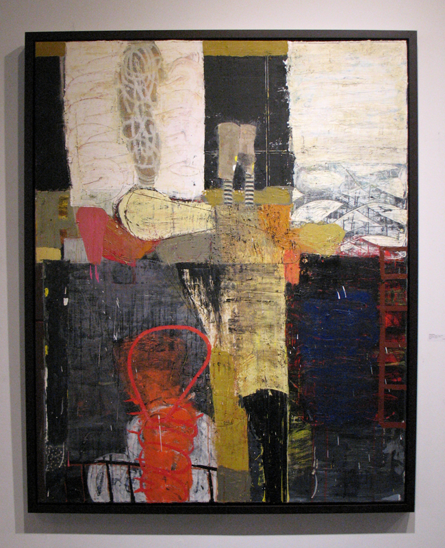
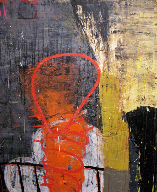
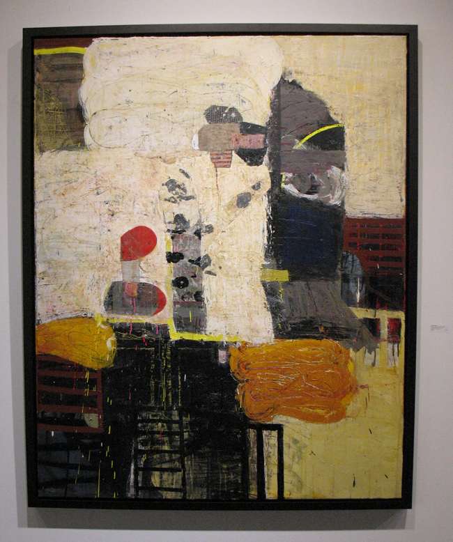
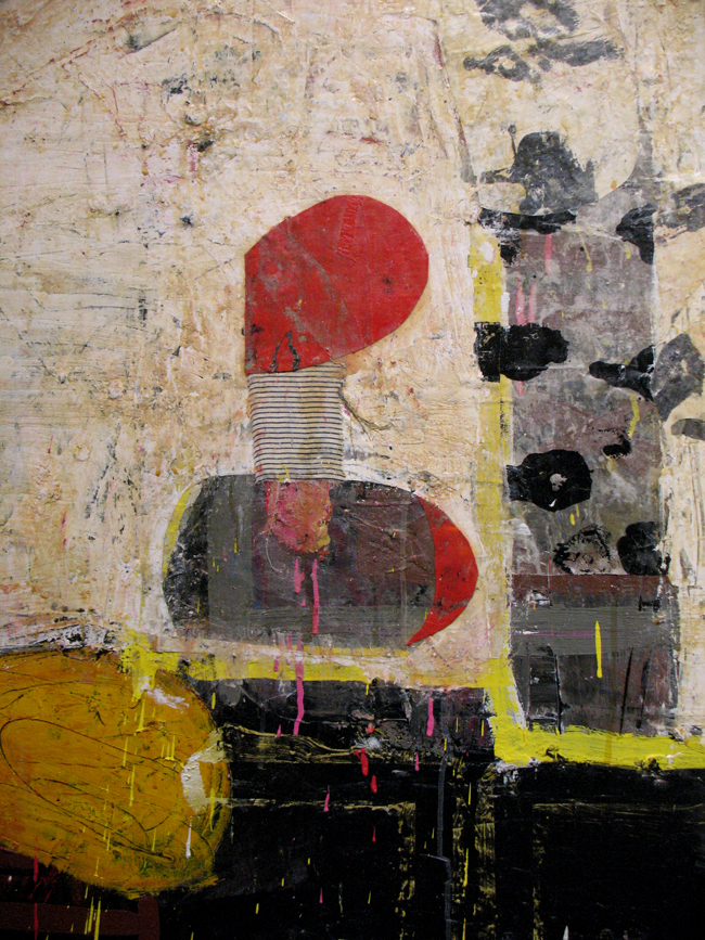
Manifest: proposition; revealed, 2018. Oil and mixed media on canvas, 72 in x 60 in. (and close-up)

What art should be able to do is to provoke and evoke a reaction. And like progressions or phrasing in modern musical composition, abstract mark making can be tracked through art’s recent historical timeline. These paintings hit us in the gut with wild and violent gestural marks, while offering a grid type structure to navigate the work via an architectural construct. I would compare Peters’ work to more intellectually provocative contemporary music in its ability to elicit emotion through the dynamics of color and form. Thomas Adès, John Taverner, Vijay Iyer offer similar compositions of complex structure, that speak to mysticism, transcendence and the sensuousness of stringed instruments.

As we talked, Peters again referenced Willem de Kooning as one of his favorite painters and revealed an anecdote that dates to the early days of Abstract Expressionism. However, he is also influenced by Matisse, the framing in some of his works could be interpreted as a riff on those celebrated windows. Vuillard and Bonnard seem to be in the mix as well, just for the Nabis’ love of pattern, texture and those shots of dense black that delineate form.

“Peters’ work is about the art of making art. He is uninterested in creating works that describe or narrate; rather, his actions are freed from historical, religious and social content and constraints.” – Lloyd W. Benjamin, III, Dean of Fine Arts, University of Arkansas, Little Rock.

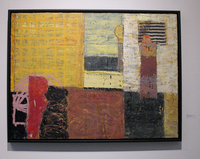
Disclosed: inner; affirmation, 2018. Oil and mixed media on canvas, 30 in x 40 in.

Tentative: underlying; spaces, 2013. Oil and mixed media on canvas, 60 in x 72 in.

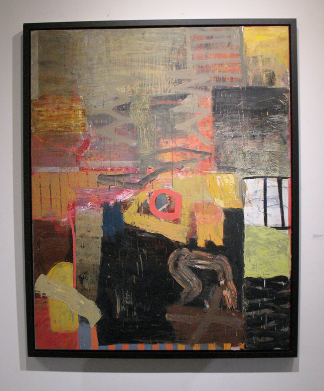
Essence: inseparable; illusion, 2015. Oil and mixed media on canvas, 72 in x 60 in. (and close-up)

Declaration: evolving; artifacts, 2018. Oil and mixed media on canvas, 48 in x 48 in. (and close-up)

Enigma: impenetrable; boundary, 2017. Oil and mixed media on canvas, 60 in x 48 in. (and close-up)

Irreducible: absolute; content, 2017. Oil and mixed media on canvas, 48 in x 60 in. (and close-up)

Recovery: infinite; apparation, 2017. Oil and mixed media on canvas, 60 in x 48 in. (and close-up)

Emblematic: integral; function, 2011. Oil and mixed media on canvas, 60 in x 48 in. (and close-up)

Displacement: returning; notion, 2012. Oil and mixed media on canvas, 48 in x 60 in. (and close-up)

Observation: presence; revealed, 2017. Oil and mixed media on canvas, 48 in x 60 in. (and close-up)

Peters also shows with LewAllen Contemporary in Santa Fe, Stremmel Gallery in Reno, Greg Thompson Fine Art in Little Rock, M. A. Doran Gallery in Tulsa and Jay Etkin Gallery in Memphis.

That anecdote: Peters was having dinner years ago with friends and the infamous Ruth Kligman, Jackson Pollock’s lover who was with Pollock when he crashed into a tree and died. Kligman survived. It’s well known that Kligman had romantic dalliances with de Kooning, Pollock and as her NY Times 2010 obituary notes, “she was friendly with Jasper Johns, to whom she once proposed, and with Franz Kline, whose former studio on 14th Street became her home and the studio where she continued to paint almost to the end of her life.” Peters’ friend at dinner asked Kligman which of the painters was the most proficient in bed. She replied without hesitation; “Kline!”

In doing some research on Peters, I found this lovely and entertaining article about him and two other artist pals who have lunched together for over thirty years.

“Time and Place” documentary  by Hop Litzwire features Peters working in his large studio.

Find recent work at the artist’s website.

Mason Fine Art is spacious, with an abundance of natural light. The exhibit is on view until April 7.
Mason Fine Art, 415 Plasters Avenue, Atlanta, GA 30324.  P: 404.879.1500
Gallery Hours  Tuesday through Friday, 11:00 AM to 5:00 PM and Saturday, Noon to 5:00 PM

Posted in Art reviews, criticism and blogs, Daily meanderings | Tagged , , , , , , , , , , | Leave a comment

Al Taylor, What are You Looking At? High Museum of Art, Atlanta

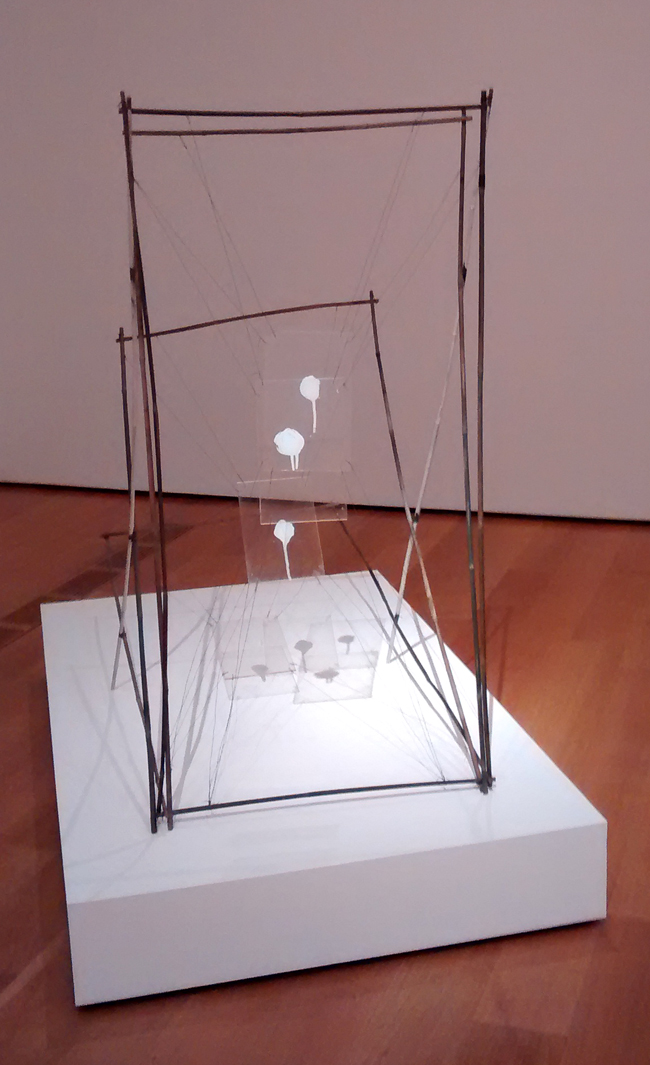
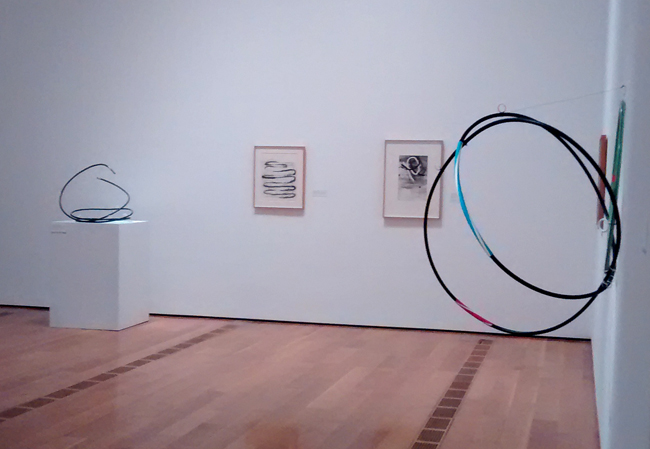
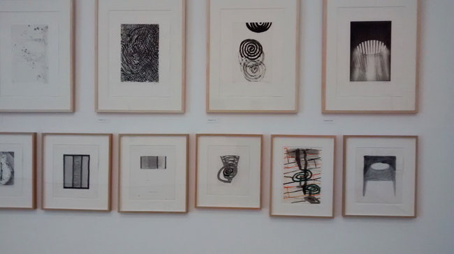
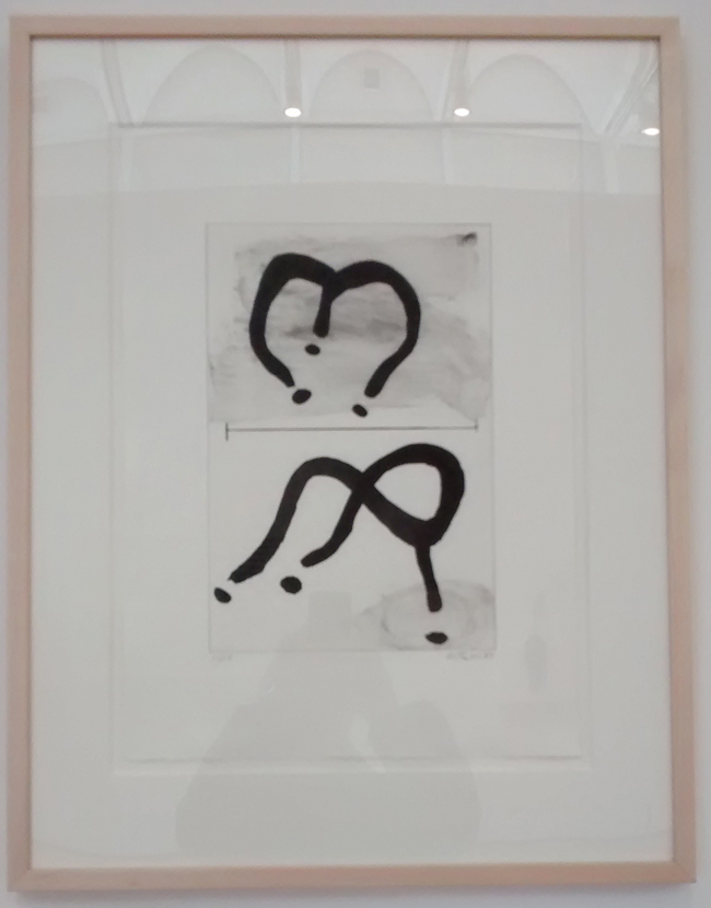
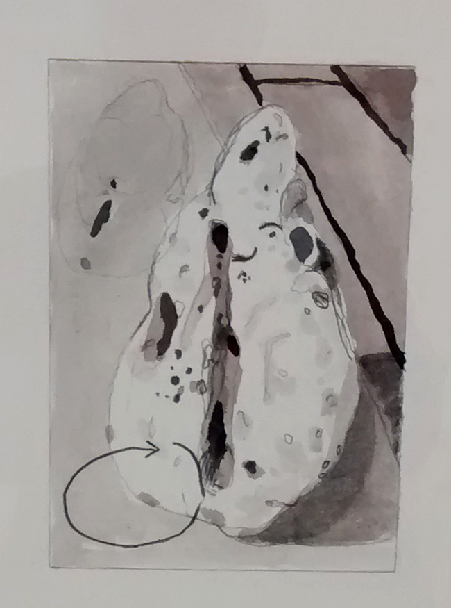
Ending March 18th, Al Taylor, What are You Looking At? is a fascinating and entertaining exhibit. Exquisitely curated by the High’s Michael Rooks, I didn’t expect all three floors of the museum’s Anne Cox Chambers wing to be devoted to this idiosyncratic artist who died far too young at age 51 in 1999. Taylor’s proficiency at printmaking, sophisticated spatial sense and his droll sense of humor fuels the exhibit, drawing the viewer into his strolls along urban streets and his keen observational skills. Does anyone ever think about repurposing pet excrement?  Taylor was able to achieve elegance in his Tinguely inspired constructions and sculptures that feature just that subject matter- or maybe Rube Goldberg is a more appropriate mentor.

If you’re normally bored or infuriated by text accompanying imagery, you won’t be at this show. Wall text thoughtfully informs without presuming to unveil the soul of the artist or his innermost objectives. It allows our own imaginations to be stimulated and teased by the artwork.

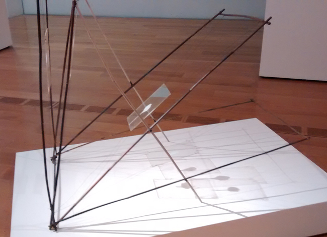
Pet Stain Removal Device, 1989. Bamboo garden stakes, Plexiglas, enamel paint, wire and electrical tape. The Estate of Al Taylor, Courtesy David Zwirner, New York/London

From the High’s website: The High Museum of Art is organizing the first museum survey in the United States to explore the career of American artist Al Taylor (1948–1999). With more than 150 sculptures, drawings, and prints drawn from several of the artist’s major series over nearly two decades, the exhibition will reveal the crisscrossing avenues of Taylor’s artistic inquiry and his innovative use of unexpected materials.”

The exhibition  features works from Taylor’s series Wheel Studies (1981–1985), Latin Studies (1984–1985), Pet Stains and Puddles (1989–1992), Pass the Peas (1991), X-Ray Tube (1995), Full Gospel Neckless (1997), and Bondage Duck (1998–99), among others.


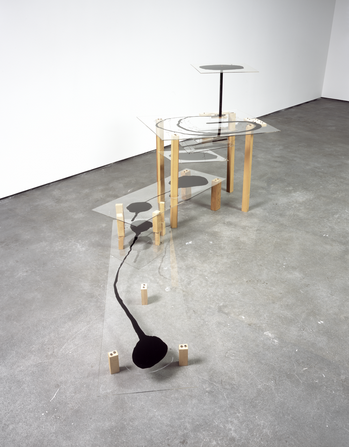
Black Piece (for Etienne-Jules Marey), 1990. Plexiglas, enamel paint, China Marker grease pencil, wood and wire. The Estate of Al Taylor, Courtesy David Zwirner, New York/London. Photo courtesy High Museum.

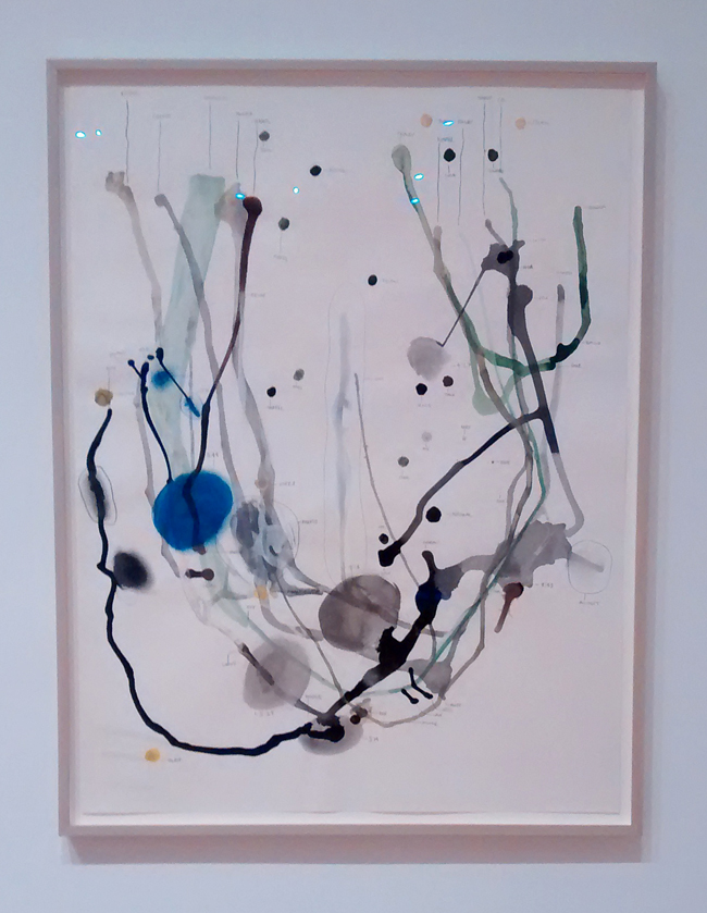
The Peabody Group #29, 1992 (close-up). Graphite pencil, watercolor, gouache, india ink, colored inks, colored pencil, and ballpoint pen on wove paper. The Morgan Library and Museum, New York. Gift of the Modern and Contemporary Collectors Committee.

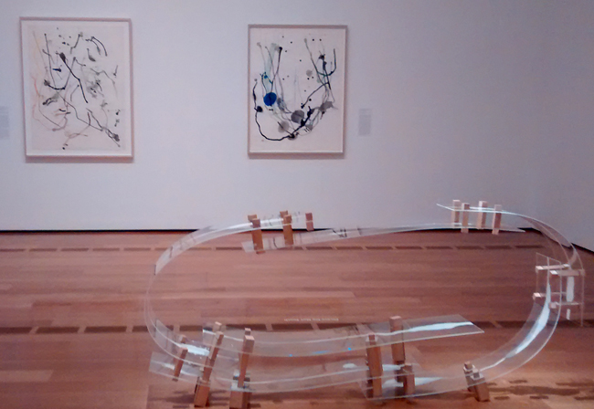
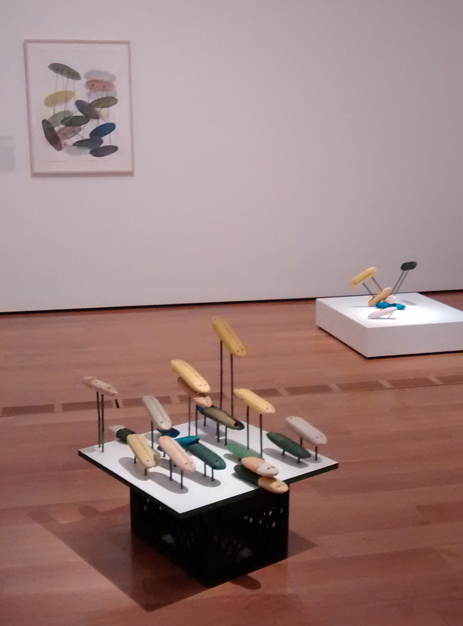
Floaters (Pill Heads) 1998. Foamed plastic fishing net floats, acrylic paint, bamboo garden stakes, acrylic mica mortar, and pencil on Formica laminate with wood base mounted on a plastic milk crate. The Estate of Al Taylor, Courtesy David Zwirner, New York/London.

The museum text describes this piece as a variation in Taylor’s “wave theory series… that uses beachcombed fishing net floats to chart the sea’s movement…art historian Klaus Kertess described as ‘Malevich-cum-Lego’.

Taken as a whole with the other mixed media paintings and wall hung constructions, it’s obvious that Taylor got a kick out of assembling oddities and found throwaways into gut wrenching laughter producing art. I wasn’t the only person guffawing in the quiet of a Saturday morning visit. In comparison with similar assemblages of folk art this work presents highly considered spatial experimentation and as the information text notes, “recalibrates the structure of what the eyes see and how the mind comprehends it.”


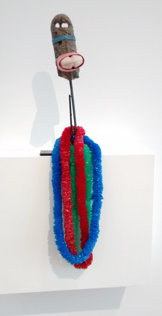
Bondage Duck #4, 1998-1999. Foamed plastic fishing net floats, rubber bands, latex coating, plastic leis, and bamboo garden stake with acrylic mica mortar mounted on a steel base. Collection of Debbie Taylor.

Thongs, 1989. From the Ten Common (Hawaiian Household) Objects portfolio. Drypoint, sugar-lift aquatint, and spit-bite aquatint printed in black ink on Zerkall Bütten paper; edition 11 of 15.

“What I am after, is just trying to let things make themselves. That’s not as easy as it sounds. It involves devising elaborate programs, systems, and methods which break down, fall apart, and change…taking on meanings and a life outside and beyond my original intentions.” -Al Taylor.

Untitled, 1990. Monotype, Image drawn in pencil and colored litho inks, printed with viscosity tints over solvent transfer on Rives BFK paper. Collection Whitney Museum of American Art, New York.

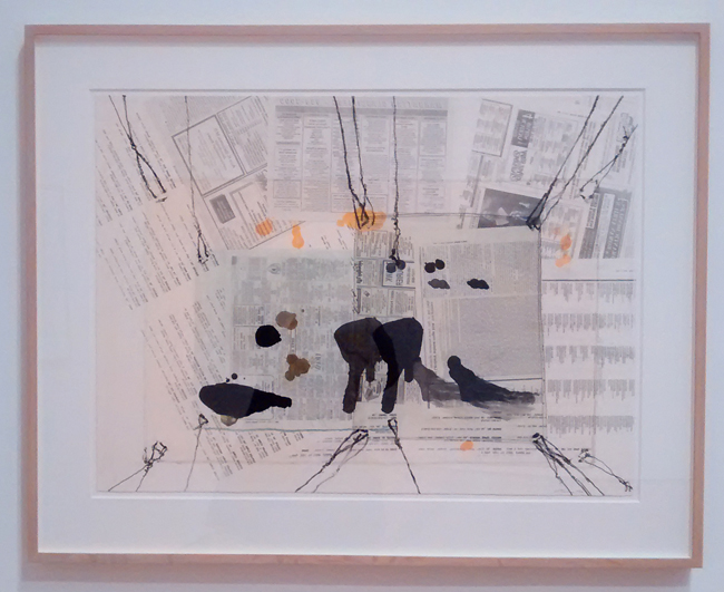
In the first monotype above, Taylor used newspaper layering, similar to Rauschenberg’s  1950s process of printmaking. The pet stain motif continues and as the text mentions, the newspaper reminds us of puppy house-training. All too well, for this former dog owner.

Avenue Junot (2) 1990. Xerographic toner fixed with solvent on paper. Private collection, London. Promised gift to The British Museum, Department of Prints and Drawings.

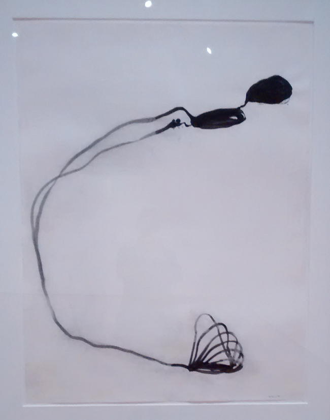
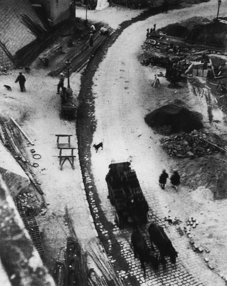
The juxtaposition of this print with André Kertész’s L’Avenue Junot de la maison de Tristan Tzara of 1926 is no accident. In 1990 Taylor spent time in Paris at a friend’s apartment that overlooked the same street. Again, streams of dog urine flowing around the street’s curve captured his imagination. The text states that “Taylor’s two imaginary puddles travel in a similar arcing pathway and converge at the bottom of his composition, where their pool becomes a sequence of loops lifting from the street and suspended in the air – foreshadowing his absurdly commonsensical idea of pet stain removal.”  But even knowing nothing about the print’s inspiration, one is charmed by the freeness of the linework and velvety blacks.


L’avenue Junot vue de la maison de Tristan Tzara, 1926. Gelatin silver print, Estate of André Kertész.

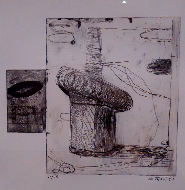
Untitled (Tight Turn), 1989. Line etching, spit bite aquatint, open bite etching, and drypoint printed in black ink on Zerkall Bütten paper. Edition 11/15. The Estate of Al Taylor, Courtesy David Zwirner, New York/London.

The text mentions that Taylor was living at Niels Borch Jensen’s print shop in Copenhagen, looked out a kitchen window and spotted an old truck tire hanging on a post set into a garbage can. Proof that Taylor didn’t wait for a monumental muse to strike, he simply used whatever presented itself at any given time of day – anywhere he happened to be. That type of artist is both familiar and rare, content to find interest and even beauty in dirt, dust and old crappy stuff lying around. If an object fell within his field of vision, Taylor utilized the moment to capture and transform. His vision just happened to be challenged (he wore glasses most of his life), but that impairment seems to have only increased his sensitivity.

Untitled: X-Ray Tube, 1995/1997, line etching, spit bite aquatint, and drypoint printed in black ink on Somerset Satin paper. The Estate of Al Taylor, Courtesy David Zwirner, New York/London.

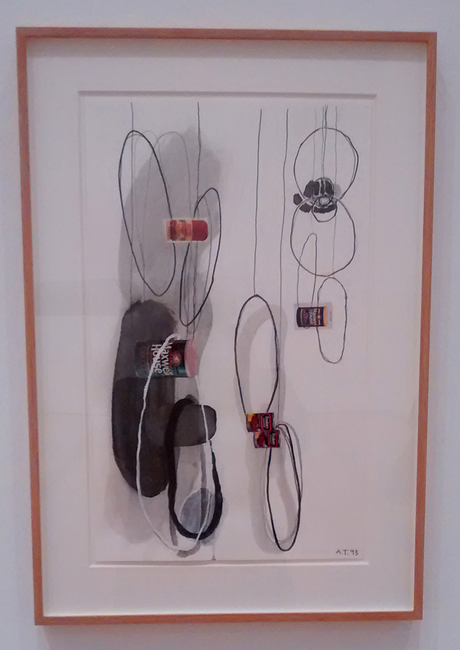
Untitled (Hoop Study), 1993, pencil, gouache, acrylic mica mortar, and correction fluid with collage on paper. Collection of Fred and Nancy Poses, New York.

The New York Times provided this obituary at the time of the artist’s death, noting that: “For many years he painted, but in 1980 he traveled to Africa and returned without enough money to buy canvas to paint on. Inspired by the way children in Africa fashioned toys out of trash, he began working with materials he found on the street. His first three-dimensional works were spare wall pieces made of broomsticks and thin wood slats that resembled skewed architectural models or functionless farm tools. He resisted calling himself a sculptor, expecting to work his way back to paint on canvas.”


No title, 1985, acrylic paint on newsprint. The Estate of Al Taylor, Courtesy David Zwirner, New York/London.

Before Taylor stopped painting in 1985, he worked with acrylic on newsprint or solid grounds in the series above, possibly color studies and ideas for his future constructions.

Al Taylor in Bern, Switzerland, May 1992 (© Martin Müller).

One of the most fun and interesting shows I’ve seen in years, the exhibit ends in two weeks on March 18th, go see it! And don’t miss this great review in Arts ATL by Catherine Fox.

Posted in Art reviews, criticism and blogs | Tagged , , , , , , , , , , , , , , | Leave a comment

Ron Saunders, “Pivot” at Besharat Gallery

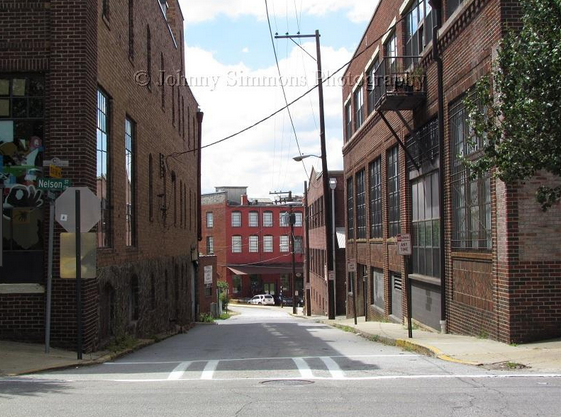
The Besharat gallery space at 163-175 Peters Street is in the Castleberry Hill historic district of downtown Atlanta. Located in a magnificent 1875 brick and timber framed building, the gallery is a fantasy of levels and rooms filled with the owner’s private art collection. If I have the history correct, it was once home to carriage and buggy storage, supplying local industry that fronted the railroad tracks running underneath the Peters Street Bridge nearby.

Ron Saunders’ “Pivot” exhibit of his new work opened on February 9th, runs until March when most of the work will be moved to the second floor for the following month. He met me at the gallery this past Sunday and we talked about the paintings he was showing on the street floor. Most of the works were completed over the last three to four months.


Frozen Pigment Painting Series, Iterative Pairs, 1 & 2.

Partial press release: Pivot represents both Ron Saunders’ future endeavors and current art practice.  Ron presents a set of new abstract paintings that expose the tension between traditional organization and uncontrolled natural forces resulting in imagery that could be coined “cataclysmic formalism”.

Along with this set of newer paintings, Ron continues his frozen pigment painting practice, which was first introduced in 2000. These works stand in opposition to the other paintings, in that they are created almost void of human intervention. These works, which are truly up to chance, are initiated by freezing water-borne paint and allowing it to melt and reconstitute over several days.

Saunders has moved around; he spent three years each in Los Angeles, New York, Seoul, South Korea, and now Atlanta. He teaches part-time at SCAD, and has an MFA from Ohio University. He considers himself a multidisciplinary artist, having engaged in performance art, media and installation.

The two sets of frozen pigment paintings on aluminum below are deceptive in the photos. In person, layering, almost flourescent chroma and dense texture can be seen. Saunders suggests that he wants to eliminate a direct hand in the pieces, although he’s obviously choosing color and location for where the paint will end up. The underlying aluminum casts a luminosity into the paint that gives the works an ethereal sheen.

Most photos courtesy of the artist.

Frozen Pigment Series, Iterations 5 & 6. Acrylic on aluminum, 32x16in

Frozen Pigment Series, Iterations 3 & 4. Acrylic on aluminum, 32x16in

When I first saw these frozen pigment works in the invitation to Saunders’ show, I was reminded of Gerhard Richter’s 2008 “Sinbad Series” that employed painting with lacquer on the back of glass. Coincidentally, the artist had helped hang a 1998 Richter exhibit at the Wexner Center for the Arts in Columbus, Ohio.

Saunders has a completely different approach both technically and perhaps in his objective for the end result. At times, he uses a vat of liquid nitrogen and drips or puts dollops of paint into it, creating flash freezing. Saunders says that the process allows the medium of the paint to take precedence over the role of the mark maker.

Painting with acrylic on plywood panels, he repurposed some of his work from 2011-12, and layering from previous paintings may be glimpsed. He will begin a painting and then use Photoshop to crop and work out color corrections and overlays. In one of the paintings on plywood, he includes a spackling compound to create depth, sanding the layers as he works. He has also used Korean rice paper as a collage element in one of the paintings.


Clotho. Acrylic, hanji and ink on plywood, 54x39in


Lachesis. Acrylic on wood, 54x39in

Saunders’ titles for most of the exhibit’s paintings on wood are derived from Greek mythology, including the Fates, “three conjoined Fates, robed in white, whom Erebus begot on Night: by name Clotho, Lachesis, and Atropos.” My ancient Robert Graves book, The Greek Myths:1 also notes that the Fates myth may have been based on the custom of weaving family and clan marks into a new born child’s swaddling bands, allotting a place in society. Clotho is the ‘spinner’, Lachesis the ‘measurer’, Atropos is ‘she who cannot be turned, or avoided.’ He goes on to suggest that “Zeus, who weighs the lives of men and informs the Fates of his decision, can change his mind and intervene to save whom he pleases, when the thread of life, spun on Clotho’s spindle, and measured by the rod of Lachesis, is about to be snipped by Atropos’s shears.” Don’t mess with Atropos.


Atropos. Acrylic, ink, plaka and spray on plywood, 54x39in

But beyond the Fates, Saunders has included the title Chronos for one of his paintings. Chronos was in Greek mythology, the father of time, not to be confused with Kronos (or Cronus), Zeus’s Titan father, who had a bad habit of eating his newborn sons to avoid being dethroned.

The painting Ananke’s Spindle, is titled for the goddess who was the mate of Chronos, and Plato would suggest that Ananke was the mother of the Fates (the Moirai) from this union. This is in keeping with the belief that Ananke was the goddess that directed the fate of all gods and mortals. She is usually portrayed holding a spindle, her outstretched arms encompassing the world.

The Greek theme did not influence any of the paintings’ genesis, but the pieces in this show could be seen to reflect mythological and earthly conflicts. Saunders’ palette uses black with vivid primary colors, to highlight dynamic brushwork. The titling only intensifies the work’s overall dramatic impact.

Chronos (with closeup from my gallery shot). Acrylic, ink, spray paint on plywood, 40x64in

The exhibit also includes a painting titled Adrasteia, after the nymph who helped to raise Zeus in secret and protect him from his anxious father.

Adrasteia. Acrylic and ink on plywood, 54x39in

Ananke’s Spindle. Acrylic, ink, plaka and spray on plywood, 40x64in

Abstract Dragons #7. Acrylic, ink and spray paint on hardboard, 32×32 in

Besharat backs up to 141 Mangum Street, where the original Pillow Tex mattress factory was discovered by yours truly in 1980, when it was full of sawdust, feathers and 3 floors of huge empty space. The realtor who allowed me access said the entire building could be had for $180k at the time. It has since become mostly lofts, but in the past offered space for performances and art. Back then, artist friends cohabited the spacious 7,000 square feet per floor in the 3 story building, but official records don’t note the area being developed until 1983.

The Besharat Gallery, 163-175 Peters Street, Atlanta, GA 30313. ph: 404.524.4781 Parking: 165 Mangum St. SW, Atlanta, GA 30313. Hours: By appointment or
Thursday – Saturday, 10am – 5pm. Email: info@besharatgallery.com

Ron Saunders: http://ronlsaunders.com
http://instagram.com/ronsaunders
https://www.facebook.com/ronsaundersart

Courtesy Johnny Simmons photography

Posted in Art reviews, criticism and blogs, Interviews | Tagged , , , , , , , , , , , , | Leave a comment

40 over 40 at EBD4

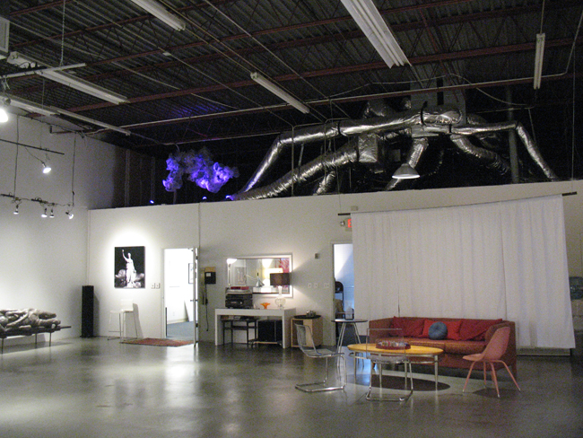
The November 11th opening at artist Elyse Defoor’s new gallery EBD4 and studio space in Chamblee was well attended by Atlanta art cognoscenti. Unfortunately, flu-like symptoms prevented my going, but I caught up with Defoor the following Saturday at EBD4. The 2,000 foot space is just off Chamblee-Tucker road in the Chamblee Commons business center. Elyse has built out a salon type area, there are two large exhibition spaces and a rear area is her working studio. I was impressed with the two mammoth roll-down garage doors, that just beg for giant paintings to be hauled through them.

The invitational exhibit, titled “40 over 40”, is a tribute to artists who are mid-career or older, although a few had never shown before. “This show champions artists who continue to take risks, explore, and do the work that they are meant to do,” says curator Defoor in Buckhaven Lifestyle, and acknowledged that she chose what she liked in terms of curating the work. A few artists are mainstays on the Atlanta art scene, one small painting is by Jerry Cullum, the city’s preeminent arts critic. Many others I had met from exhibits years ago, or through the Seek ATL group, founded in 2011 by the now New York based painter Shara Hughes and Ben Steele, who still resides here.

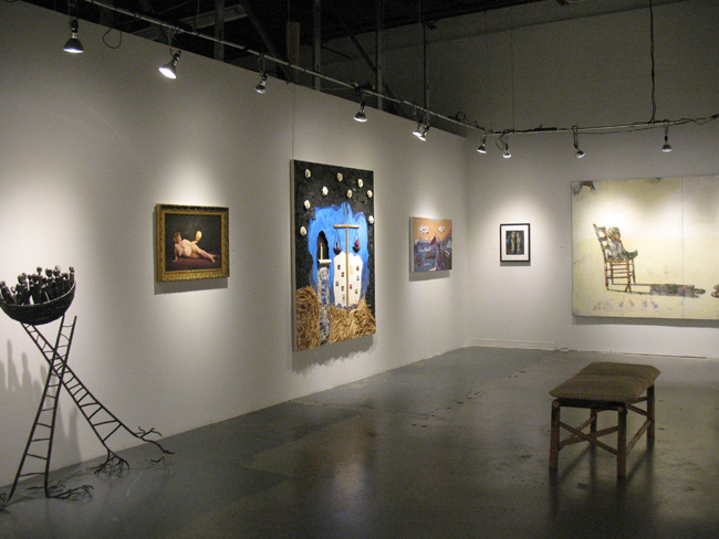
The show includes sculpture, painting, printmaking, drawing and mixed media, photography, fiber and textile art and provides a good overview of a strong group of artists who have devoted their lives to making and creating. What stands out is the diversity of both style and mediums, but because of the thoughtfulness of the installation the entirety of the exhibit flows smoothly, and sometimes surprisingly, throughout the space. I missed a few artists in this post, please head out to Chamblee before the show ends to catch everyone’s work.

The front gallery has a small seating area.


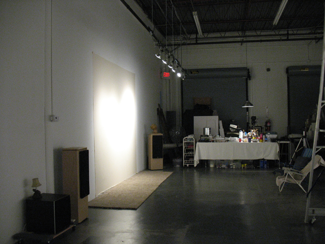
Elyse has her studio towards the back of the space.

Some of the artists had until recently, studio spaces at the Arts Exchange on Kalb Street, now slated to be developed and transformed into “creative office” space.


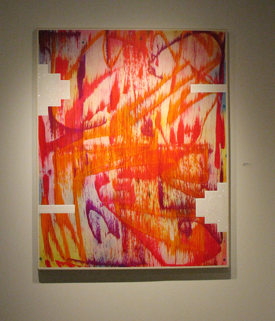
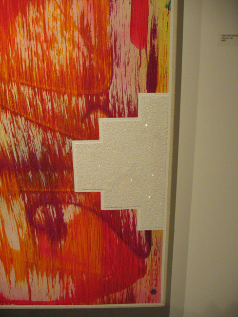
Marc Brotherton, Killskreen 1.81. Acrylic and glitter on canvas. Brotherton’s glittery geometrics are a key signature in his works.


Anne Rowles, Porosity. Cotton thread, found doilies, tubing, wire


Lisa Tuttle, Skin. Dye sublimated print on fabric, edition of 2

Martha Whittington, Material Study. Leather, mahogany, brass, cotton cording

Leisa Rich, Tolbachik’s Cup Coral. PLA: plant-based biodegradable plastic, fabric, artist original photo heat transfers, thread, resin and microbes

Steven Anderson, 89 Years #2. Marker and pen on paper mounted on canvas on panel with UV varnish

Terri Dilling, Cloud Shadows. Acrylic and mixed media on panel

Phyllis Kravitz, Tableau. Wood, plaster wrap, paint, wire, paper

Jerry Cullum, Homage to Rexroth, I. (painted 12/22/2005, Kenneth Rexroth birth centenary) Acrylic on wood with found frame


Hollis Hildebrand-Mills, Rider. Collage oil and acrylic


Jamie Ballay, Me, Myself and Mine Eye. Oil on panel

Ande Cook, Field Botanik. Acrylic on birch panel

Anita Arliss, Murder in Moscow. Oil paint and UltraChrome ink on canvas


Lisa Alembik, Spider: ‘the quintessential american narrative…quest for home’ Graphite and conte pencil on Rives paper. Quote from Junot Diaz


Joe Dreher, Plant Life. Acrylic paint on wood panel


Eileen Braun, Turning Point. Mixed media with fiber and encaustic wax

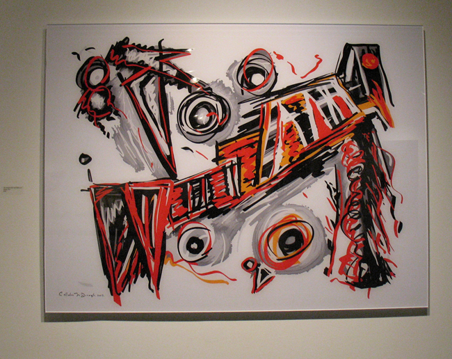
Callahan Pope McDonough, Django 2017. Face mounted archival pigmented print, 1/4″ acrylic


Richard Harris, Modern Tessellation #4. Acrylic and watercolor on canvas

Temme Barkin-Leeds, Twelve Best: Unaware. Oil, acrylic, ink, marker, graphite on canvas

Angus Galloway, Untitled. Drawing mounted to panel


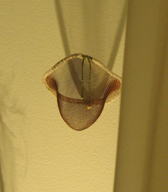
Kathleen Gegan, Your Shadow Kisses My Twin Cup, Curving Space Time. Woven copper and nylon


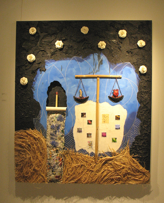
Christopher Hall, Amor Fati. Mixed media on canvas with electric candle

Rose M. Barron, The Thinker. Partial print over archival pigment ink on fine art paper


Anna Hamer, Back and Forth. Ink and Acrylic on watercolor paper


Julie Henry, Special construction no. 2. Assemblage of cardboard, paper, paint and vintage dry cleaning tags


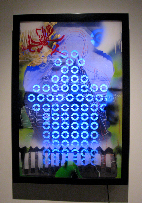
Michael Jones, Government Issued. LED lights, archival print, marker, spray paint, gold leaf


Susan Ker-Seymer, Folio. Acrylic, graphite, and canvas on wood panel

Andrew Huot, Walks with Rosie. Artist proof of 20

Judy Lampert, Untitled. Archival print on Japanese Kozo paper

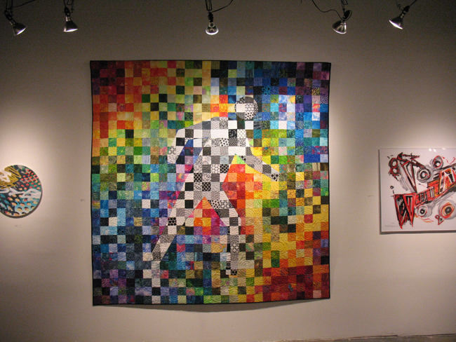
Branda Mangum and John Morse, Walking through the Colors. Quilted cloth.


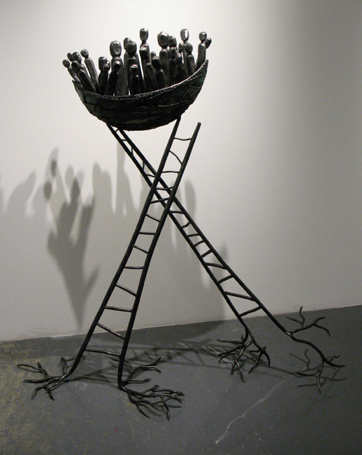
Corrina Sephora Mensoff, Uprooted Voyagers. Forged and fabricated steel, recycled steel

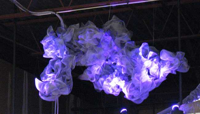
Melissia Fernander, Forty Thoughts. Window and lighting. This piece was suspended from the ceiling near the front salon area.

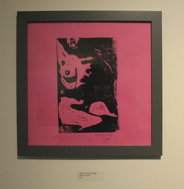
Carolyn Rose Milner, Woman’s Torso. Woodcut print

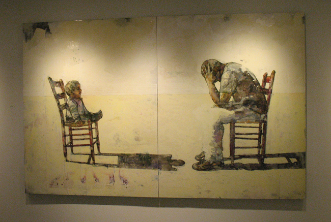
Karl Kroeppler, Conversation No. 6. Mixed media on paper

Rick Robbins, Gatherings – into the light. Oil on canvas


David Robinson, Blue Flow. Ceramic with underglazes

Stacie Rose, Candy Pill. Acrylic and mixed media on wood

The exhibit has been extended until January. Gallery hours are noon to 6pm Saturdays and by appointment.

EBD4, 2382 Chamblee Tucker Rd., Chamblee, GA 30341. Ph 404.667.1902, ebd4@bellsouth.net

Posted in Art reviews, criticism and blogs, Interviews | Tagged , , , , , , , , , , , , , , , , , , | 4 Comments

Anthony Greco at Thomas Deans Fine Art, Atlanta

A friend recently gave me the 2010 book, Modern Women, Women Artists at MoMA, and this quote in the forward from Anne-Marie Sauzeau-Botti is a good introduction: ‘I don’t believe in “feminist art” since art is a mysterious filtering process which requires the labyrinths of a single mind, the privacy of alchemy, the possibility of exception and unorthodoxy rather than rule.’

The text also reminds us that in 1817 John Keats suggested that the ideal state of mind of the poet or artist as “capable of being in uncertainties, mysteries, doubts, without any irritable reaching after facts and reason.” Both sentiments could describe how Anthony Greco has been making art since he devoted his life to painting back in 1966.

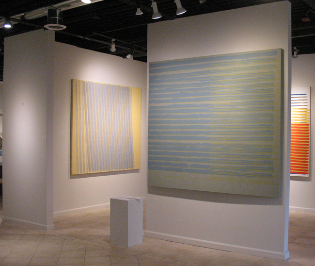
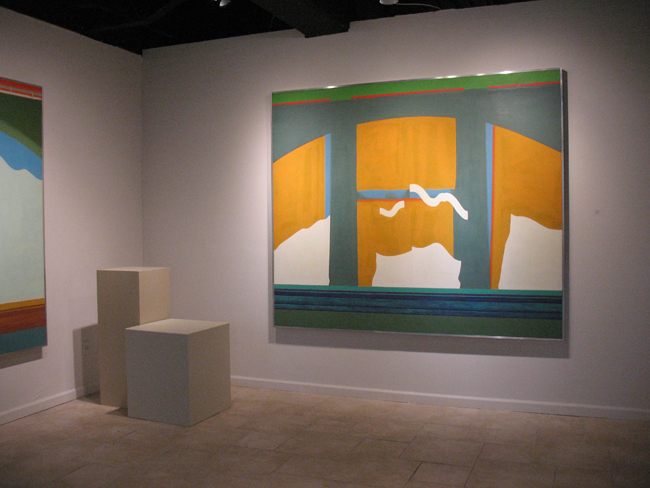
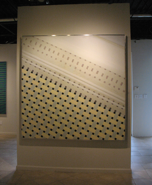
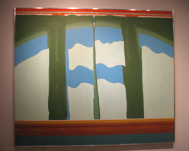
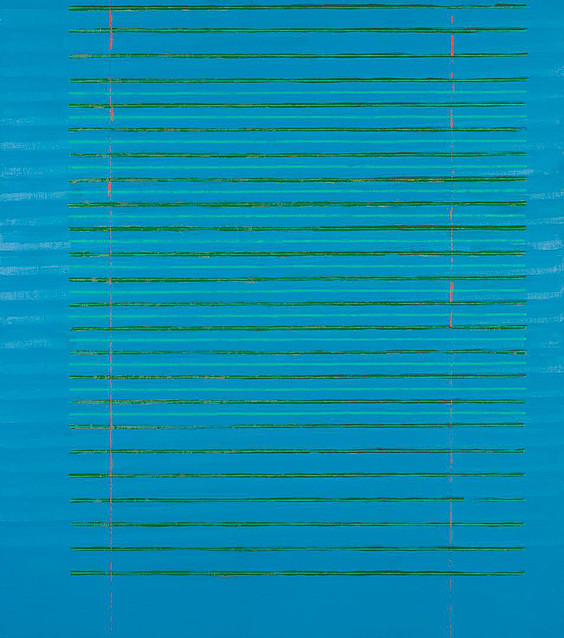
Currently on exhibit until November 11th at Thomas Deans Fine Art are sixteen of Greco’s minimalist paintings from 1970 to 1977. These paintings were a departure from his figurative work, he wanted to “make work that wasn’t fed by some visual object or illusion of space. I wanted them to be contained by the canvas and not imply that there was more to see outside it.” The earliest of the works were “curtain” paintings from 1970, clearly influenced by Matisse. From the gallery press release: “In the tile paintings made in the same year, the artist rejects atmosphere and illusionistic space altogether.”

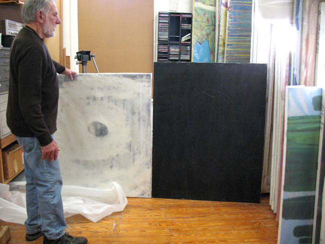
The painter and professor emeritus taught painting for 40 years at the Atlanta College of Art (now Savannah College of Art and Design or SCAD). From 1976 to 1982 he was Dean of the college. Celebrating his 80th birthday this year, the energetic and youthful Greco met with me earlier this week at his second floor studio in Decatur. The space houses a few former Beacon Hill studio artists.

Greco1a

Greco sent handwritten notes to Thomas Deans gallery in explanation of the genesis of these large paintings on view in the exhibit, which are not necessarily minimalist in the same vein as say, Ellsworth Kelly, Sol LeWitt, or Robert Mangold. Greco’s work very much shows the hand of the painter with its shaky wavers, the messiness of the medium, drips evident between stripes and grids.


A few of the predominately striped paintings refer back to the painter’s early studio at 314 Luckie Street near what is now the Centennial Olympic Park in downtown Atlanta. Photos are my own and some courtesy Thomas Deans Fine Art. All work in the show is oil on canvas.

Installation4

Foreground painting: 314/Fifteen, 1976. 68x76in. Left wall: 314/Nineteen, 1977. 68x76in

Below: Curtains #3, 1970. 76x90in.

Installation5

Installation2


Tiles #2,1970, 72x72in

Growing up in a blue collar family, his dad a truck driver, Anthony was the first in his family to go to college. He attended Catholic high school, and in his senior year the school hired an art teacher who noticed his talents and encouraged him to apply to the Cleveland Institute of Art. Greco ended up getting a half tuition scholarship. After graduating in 1960, he travelled in Europe, then started his art career in earnest after receiving a Masters of Fine Art from Kent State University. The same year he graduated, in 1966, he began teaching at the Atlanta College of Art and continued until his retirement in 2006.

Curtains#2

Curtains #2, 1970. 76x90in

314_Ten


314/Ten, 1975. 68x60in

ToCharlesIves

To Charles Ives, 1981. 65x81in

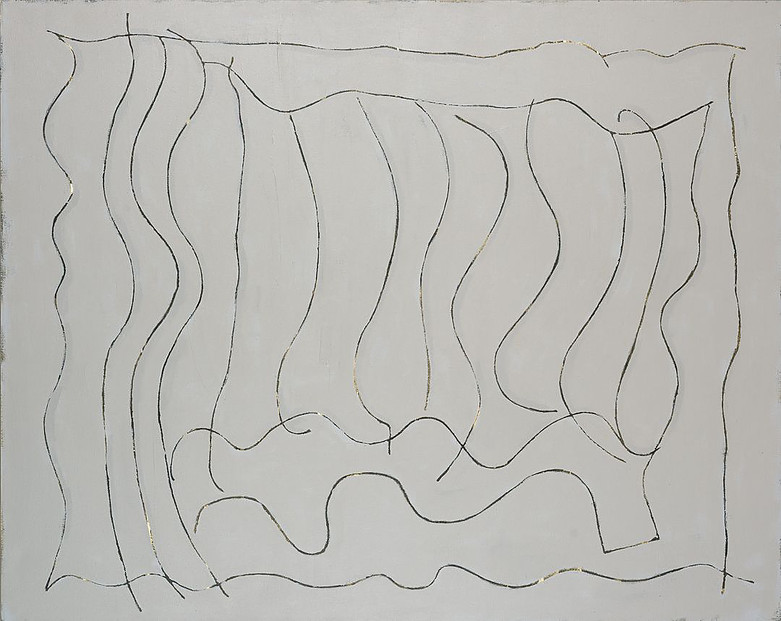
A later painting in the exhibit titled “To Charles Ives” (above), its calligraphic snaky lines eliciting homage or reference to Brice Marden, is an experimentation with laying rope on paint, pulling it off and scraping some areas to reveal layers of color beneath. Greco says he paints with music in the background but that the work does not usually overtly reference it. However, he is intensely interested in classical music.

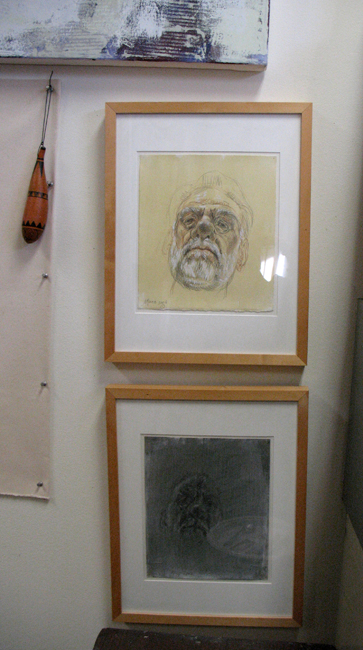
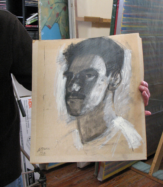
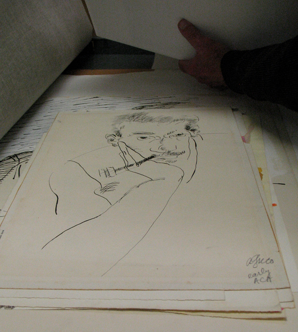
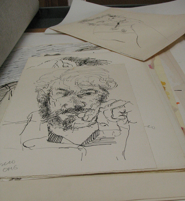
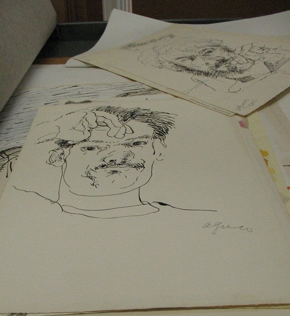
He pulled out various charcoal and ink drawings on paper from flat filing bins and I was struck by how adept he is at working from life. His line work is effortless and loose in the best tradition of gestural drawing. He says he has been doing self portraits over the years and that it’s “fun to see the progression of aging.” Not sure most of us could agree to the premise, but it speaks to his love of drawing. A chiaroscuro head is an early work from his years at the Cleveland Institute of Art, he resembles a young Franz Kline.

Greco3Greco6c

Greco6 Greco6a Greco6b


Greco4


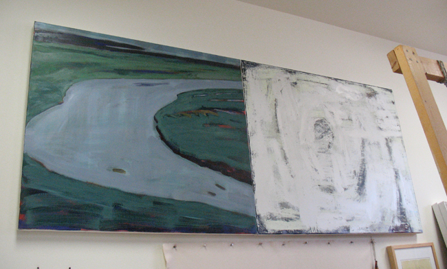
A few of his more recent works reference politics and the second Bush presidency. A diptych (above) shows a relatively serene abstraction of a landscape (or it could be) on one panel, and on the other panel what Greco referred to as hurricane iconography – similar to the symbols one might see on The Weather Channel.

Greco9

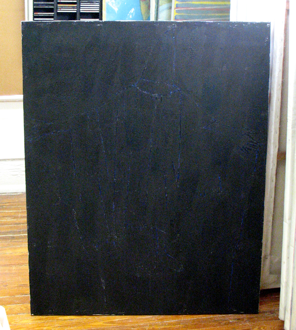
Some of his work echoes the landscape, although in his most successful pieces this has been subsumed by abstraction. Another diptych portrays a calligraphic depiction of an Abu Graib prisoner with hood, scraped into an almost black background which was very difficult to photograph. The emotional impact of this work is impossible not to grasp; the blue/black field with a brighter cobalt blue seeping through scraped areas that limned the “figure” intensely disturbing.

Greco9a

Greco1


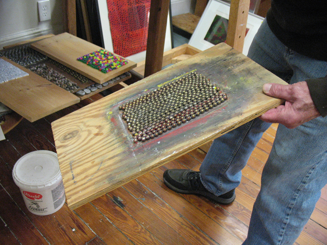
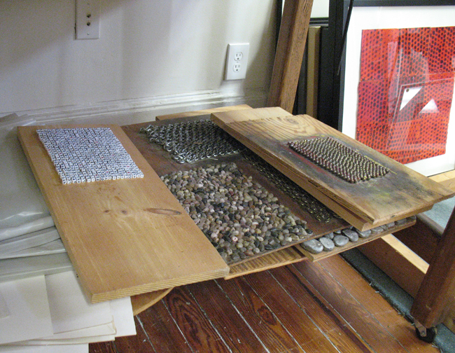
His patterned monotypes are developed from rectangular wooden panels into which he has drilled holes and pressed wooden pegs. On other panels, he has glued round beads, small porcelain alphabet beads, pebbles or metal chain link onto the surfaces. He uses acrylic paint and Arches paper or a similarly heavy cotton rag paper for these superbly produced prints.

Greco2 Greco2a Greco2b


Greco5aHis use of color is both spare and generously exuberant. It’s hard to pin him down in any one style over the decades, as he continues to change and experiment. He has returned to figurative and still life work, while also working in abstraction.

still life #2_greco_001


Still Life #2 (c 1965) is part of Georgia’s State Art Collection.

He showed me a couple of standalone painted sculptures from wood, with moving and sliding panels that formed words like “flag” or “stop”, as though a large letterpress had been dismantled and reconstituted.

Greco11

A series of earlier circular paintings was inspired by looking through a kaleidoscope and painting the patterns seen projected.
Mr. Greco is a painter’s painter. His focus over the decades of teaching and raising a family has been an exultant experimentation in painting. He leaves it to the viewer to interpret and does not seek to stamp his process with any theory or philosophy. The work speaks for itself.

Anthony Greco’s work can be found in various Atlanta collections, including the Jimmy Carter Presidential Library, Coca-Cola, Georgia’s State Art Collection, the Mint Museum of Art, the Butler Museum of American Art, Kent State University and many private collections.

A digital version of the exhibit is available on the gallery’s website, and an E-catalog can be found here. Thomas Deans Fine Art, 690 Miami Circle NE #905, Atlanta, GA 30324. Gallery hours: Monday – Saturday, 11-5. ph: 404.814.1811

Posted in Art reviews, criticism and blogs, Daily meanderings, Interviews | 3 Comments

Decatur Glassblowing Studio and Course Horse

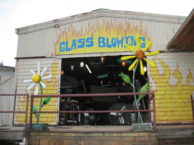
A representative from CourseHorse, a discovery and booking tool for local classes, contacted me to offer a free class in exchange for writing a review on my blog. With multiple classes in art, cooking, tech, professional, life skills, performing art, language and even classes especially for kids, it was hard to choose. Since I’ve collected blown glass for decades and Decatur Glass Blowing was on their list, I chose a 2 hour class on a friday night and made my first bowl. CourseHorse offers several other glass blowing classes in Georgia and the Atlanta area, you may find one closer to you.

Entrance

Studio2

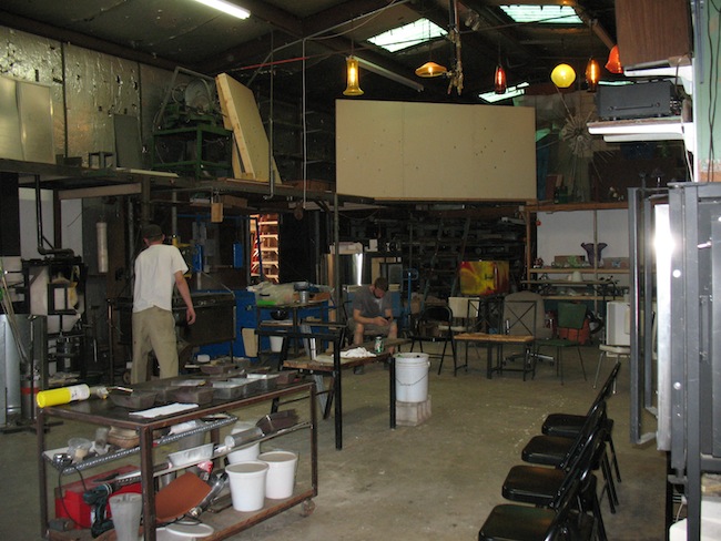
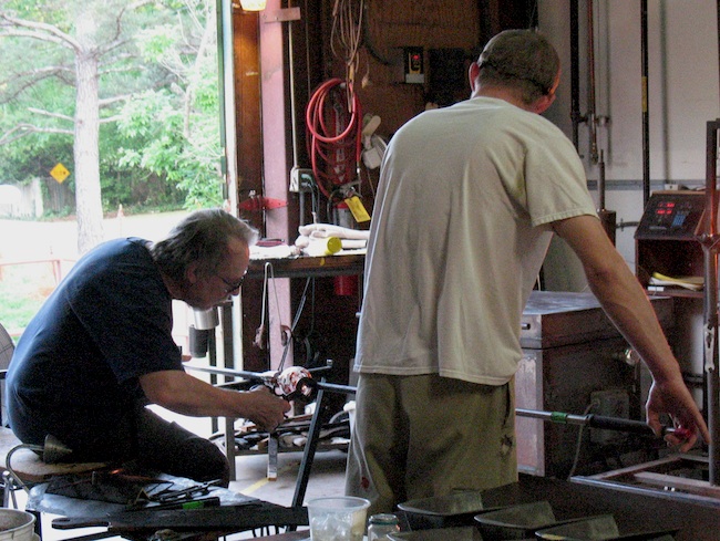
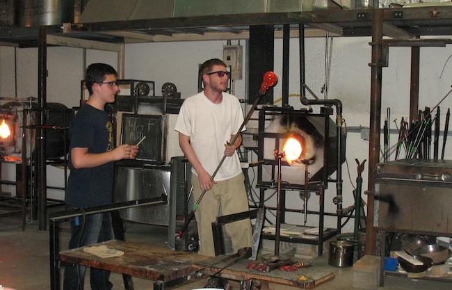
Seven of us attended the one-on-one class at Decatur Glassblowing, which afforded me the chance to be taught by a veteran glassblower who had been practicing the art for 44 years. The other assistant to founder Nate Nardi’s studio was much younger, but highly skilled as well. As I chatted with my teacher, he gave me a short history lesson about glass in America. Glassblowing dates back to the 1st century BC and the Roman Empire, but quickly expanded into the Mid East and Europe.

In the early 1600s a few Germans and Poles arrived by ship to Jamestown, VA and discovered vast amounts of forests to fuel their ovens, endless sandy beaches and oyster shells for lime. A glass-house was built in 1608 and the first factory began exporting glass made in the U.S. back to England. “New Jersey and Pennsylvania had excellent sands and extensive forests, so for many years the glass houses of New Jersey dominated in glass production. To the north in Massachusetts, on the Island of Sandwich, there arose a group of glass houses and the glass produced there still bears its name.”

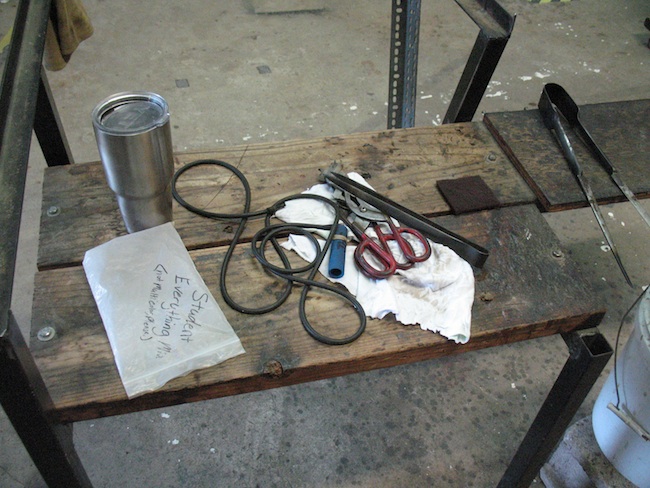
Bench with tongs

Bench with duckbill shears and various sized “jacks”.

Here is a more in depth glossary of tools and equipment used in glassblowing.

Applying color


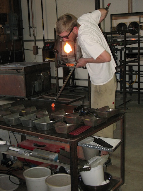
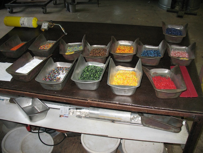
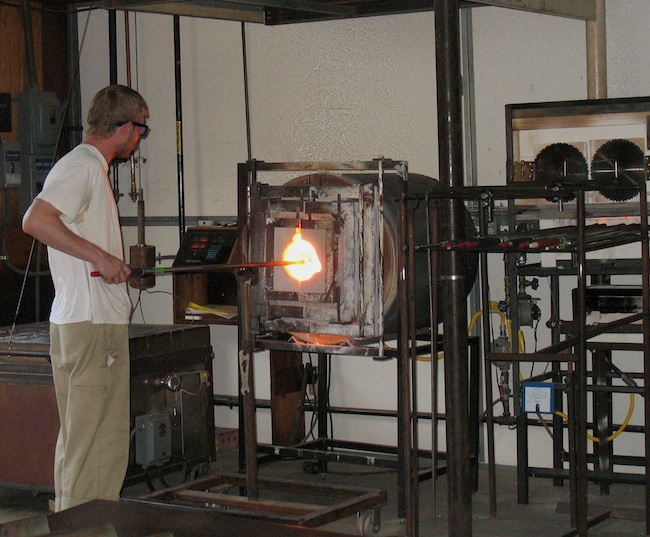
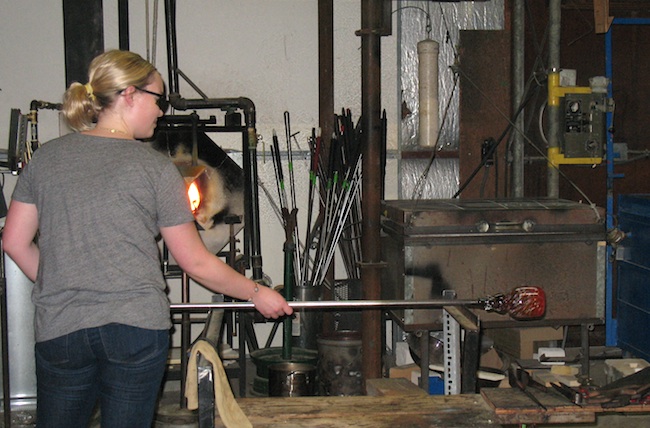
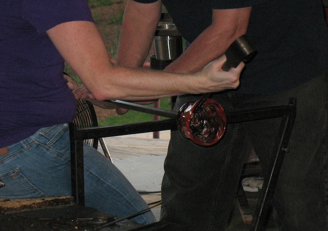
We first had a demo on safety issues and the steps that we’d be following during the process. Everyone wore protective safety glasses and a heat resistant arm guard was provided during the shaping of the bowls. At no time was any one of us left on our own, but the teachers also encouraged us to engage without fear. As an admitted scaredy-cat around any potential hand or eye threats, my fears proved relatively unfounded. Once the glass is heated on the end of the rod, it’s dipped into colored glass chips and rests gently for a second or two.

Colors

Cutting off

During the initial demonstration, my instructor uses a clamp like cutting tool to snip the hole for the opening of the bowl.

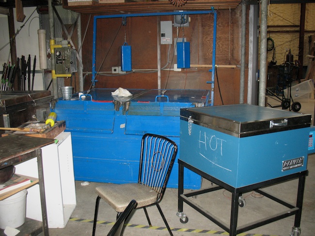
Any glass that cools down too quickly is liable to crack, so there is a slower oven for annealing or cooling down from the initial 2,000 degrees in the firing oven or “glory hole”.

Cooling oven

Large blue Annealing or cooling oven in the background.

Firing

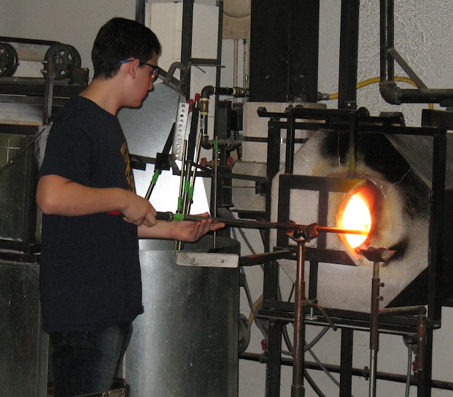
Heating the molten glass on the end of the blowpipe in the “glory hole”. The process of “gathering” is similar to using a dipper to take honey from a jar. Glassblowing furnaces are typically gas-powered and are heated to 2,000 degrees Fahrenheit.

Turning

Turning the rod keeps the taffy like glass rotated to maintain its shape.

After blowing

Checking the bubble after blowing.

Student firing

Student refiring in the “glory hole”.

Shaping with tongs

Shaping the bowl with “jacks”, similar to large tweezers or tongs.

Gallery2

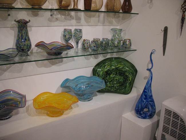
The gallery.

Gallery3 Gallery4


Gallery1

Studio Gallery.

This video is a great overview of Nardi’s studio and processes.

CourseHorse was begun in 2011 by two NYU graduate students. After an unproductive search for a cooking class, the duo startup team of Katie Kapler and Nihal Parthasarthi won $75,000 from Stern New Venture Competition for their idea. Since then, Course Horse offers +70,000 classes to over 200,000 members in over a dozen cities around the country. They’ve also been noted in Forbes as one of America’s Most Promising Companies. Many thanks to Courtney, who signed me up!

Dragonfly

Dragonfly.


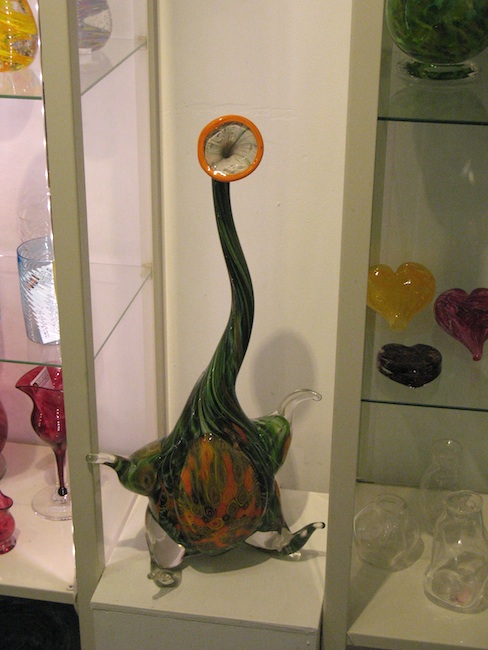
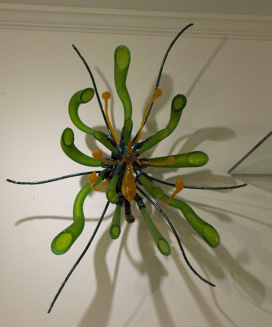
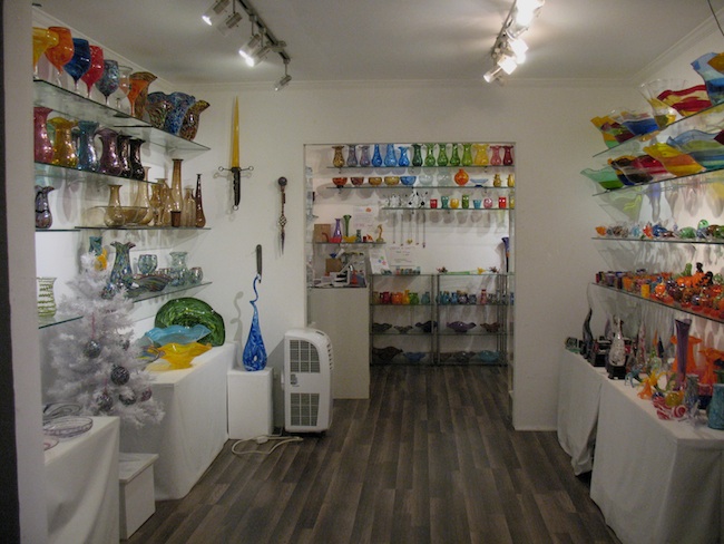
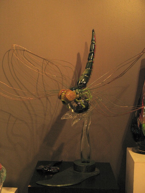
This was a fascinating and educational class. While glassblowing is seemingly spontaneous, the skills required to produce the end results can be honed over decades. I was particularly taken with Nate’s dragonfly glass sculpture, (more bugs here) and some of his earlier grad school sandblasted abstract glass work. You’ll just have to stop by and see for yourself, since I didn’t get a photo of those last fabulous pieces. I’ll be posting my own bowl here at a later date, after I pick it up.

An open house between 5pm and 10pm is coming up this Saturday, April 29th and again on May 20th. See the studio’s Facebook page for event updates. Demos, food, music and drink are provided free of charge. Raffle tickets for giveaway items are only $1.

Decatur Glassblowing, 250 Freeman Street, Decatur, GA 30030.
ph: 404.849.0301
email: natenardi@yahoo.com
Hours: Gallery | Tues-Sat |2-6 pm

CourseHorse is currently still in beta mode for Atlanta, but more classes will be coming soon! Be sure to sign up with your email address and locale to receive more information on when classes near you will be available.

Finally, a 5 minute demo from Jamestown, Virginia’s Glasshouse. Visitors can see the remains of the original furnaces used by those early glassblowers and watch as modern glassblowers produce wine bottles, pitchers, candleholders and various other glass objects. Today’s glass furnaces are heated by natural gas, rather than by wood as in 1608. Glassblowers, however, use tools and methods similar to those of the 17th century.

Posted in Art reviews, criticism and blogs, Daily meanderings | Tagged , , , , , , , , , , | 4 Comments

Hathaway David Contemporary in Atlanta

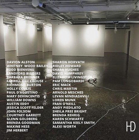
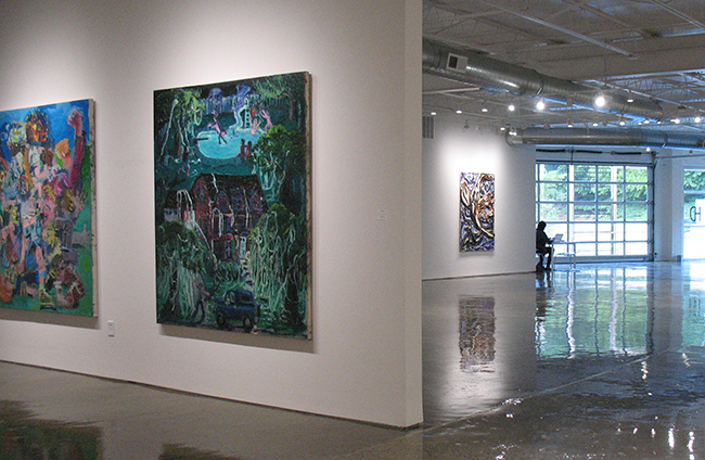
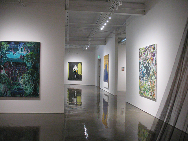
In my old vinyl collection is the Velvet Underground’s 1967 iconic LP with Andy Warhol’s yellow banana on the cover. A song on that album written by Lou Reed, “All Tomorrow’s Parties”, is an apropos title for the inaugural exhibit this April of the new Atlanta westside gallery, Hathaway David Contemporary, or HD for short. New York painter and founder Michael David and co-founder Laura Hathaway launched the space with an opening, that despite torrential rains, drew about 800 attendees, including Atlanta artists, writers and curators, museum directors and a few of the Brooklyn artists who traveled for the show.

HD37

The show was a mix of artists from Michael’s former Brooklyn based Life on Mars gallery along with Atlanta artists that he has also shown. Unfortunately, he recently announced that the New York gallery would be closing this year. David taught at both SCAD in Atlanta and also at the Atlanta Fine Arts Atelier that he founded here in 2002.
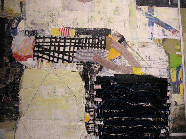
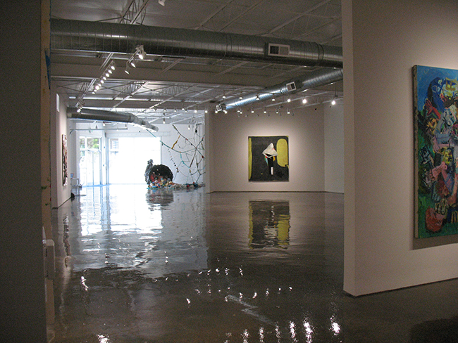
His new westside gallery is 8,700 square feet huge, with high ceilings and polished floors, an imposing glass garage door and plenty of storage space. I attended the opening and returned on a Saturday when Anna, the very pleasant gallery assistant, answered questions and graciously showed me some of the paintings that were being held for the upcoming Re-Hang exhibit that will open next week on June 16th.

This is a highly condensed version of the show. Don’t miss the opening next thursday to view the entire exhibit.

Screen Shot 2016-04-29 at 10.28.17 PM HD23


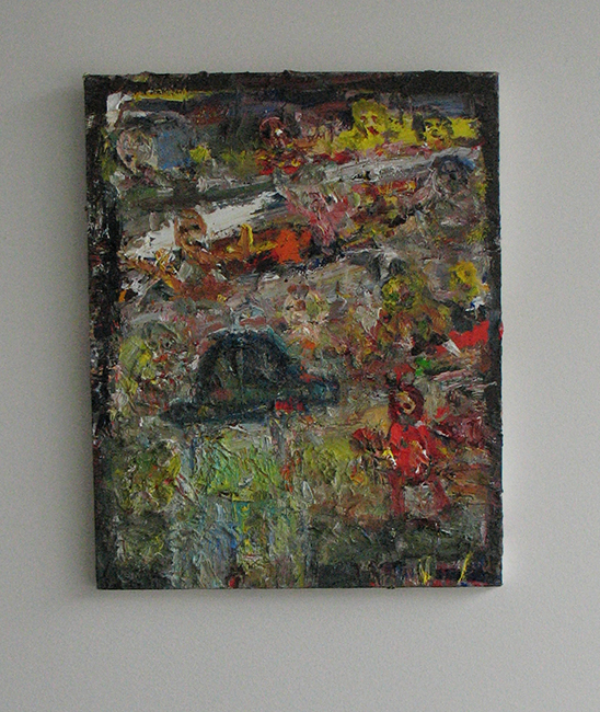
I know some of the Brooklyn artists in the show, like Loren Munk and Farrell Brickhouse, only through social media. I was happy to finally meet Farrell in person, along with Mary DeVincentis, at the opening. My 2009 interview with Loren Munk was precipitated by seeing his YouTube videos online, under his alter persona, the James Kalm report. I became Facebook friends with Farrell back in 2010 and have enjoyed his daily postings of his thickly painted figurative abstracts.

HD42


Farrell Brickhouse, SciFy #6, 2015. Oil on canvas, 20x16inches.

HD34 HD24


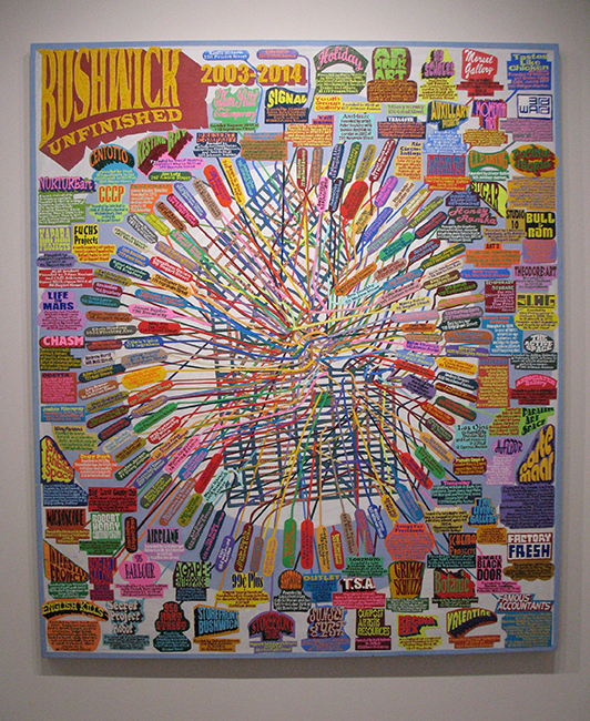
Loren Munk, Bushwick Unfinished, 2003-2014. Oil on linen, 84x72inches.

HD19


Mary DeVincentis, Swinger, 2016. Acrylic on yupo, 26x20inches.

HD1

HD1a

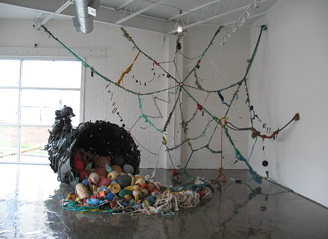
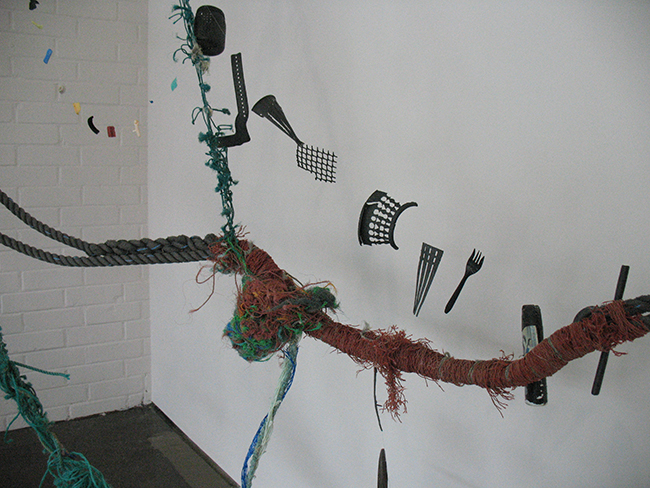
Pam Longobardi, Bounty Pilfered, 2014. Ocean plastic from Alaska, Greece, Hawaii, Costa Rica on the Gulf of Mexico; steel amature and driftnet floats from the Pacific North Gyre, 136x84x54inches.

Longobardi is an Atlanta based artist/activist who sources materials from plastic garbage patches littering the oceans; “this strange material legacy that we’re leaving behind.”

HD9


Brenda Goodman, Almost a Bride, 2015. Oil on wood, 80x72inches.

HD11


Arnold Mesches, Postures 2, 1981. Acrylic on canvas, 60x120inches.

Mesches has been around for some time, he’s 92. Take a look at his impressive bio and other symbolic and figurative works.

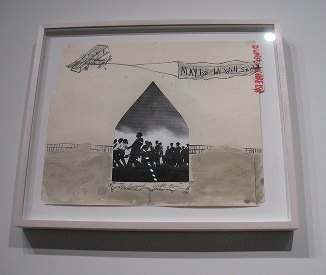
HD12HD12c William Downs, The Longest Walk, 2016. Ink wash and mixed media on found folders, 15x18inches.

William Downs is an Atlanta based artist and currently a lecturer in drawing and painting at Georgia State.

HD14

Todd Bienvenue, Boys Will be Boys, 2014. Oil on canvas, 76x67inches and High School Hi Jinks, 2014. Oil on canvas, 76x67inches

HD13


Shara Hughes, Being Shady, 2016. Oil on canvas, 58x52inches.

Shara is one of the founders of SeekATL, an artist run group that coordinates monthly studio visits in metro Atlanta and environs. Originally from Atlanta, she recently relocated back to Brooklyn.

HD16HD33a

Jessica Scott Felder, Compass Rose, 2012. Installation, 144x72x72inches

HD17


Karen Schwartz, Neither Fish Nor Fowl, 2016. Ink, oil, charcoal on linen, 74x74inches.

HD38


HD38b


Fran O’Neill, Shadow, 2016. Oil on canvas, 84x84inches.

The bold and gestural work of Fran O’Neill gives Gerard Richter a run for his money. Rather than using a giant squeegee, her own body – literally her arm – is involved in the brushwork.

HD39 HD39a

Sharon Horvath, Dark Matter (for my Father), 2010-2014. Pigment, ink and polymer on paper on canvas, 60x84inches.

HD41 HD41a


Whitney Wood Bailey, Order/Chaos: Ages, 2016. Oil and mixed media on paper, 60x40inches.

HD43 HD43a


Thorton Dial, A Bird Will Always Try to Fly, 1991. Oil, braided rope, enamel, burlap, carpet and industrial sealing compound on wood, 72x48inches.

The prolific and self-taught Dial died this past January. The Metropolitan Museum of Art owns 13 of his works. Dial once told Atlanta collector William Arnett that ““Art is like a bright star up ahead in the darkness of the world…”

HD46


Pam Longobardi, Downstream, 2013. Ink, gouache, acrylic, pigment and devalued currency collage on paper, 13x11inches.

HD22

HD36

Through Aug. 14. 10 a.m.-6 p.m. Mondays-Fridays; 11 a.m.-7 p.m. Saturdays. Free. Hathaway David Contemporary, 887 Howell Mill Road N.W. (behind the restaurant Bocado), Suite 4, Atlanta. 470-428-2061, www.hathawaydavid.com.

Posted in Art reviews, criticism and blogs, Daily meanderings | Tagged , , , , , , , , , | Leave a comment

Cathryn Miles and Scott Upton at Thomas Deans Fine Art, Atlanta

The two painters in this exhibit through Saturday May 21 at Thomas Deans gallery on Miami Circle offer similarities only in their obvious command of their mediums. Photos of individual works courtesy of Thomas Deans Fine Art.

The press release offers this synopsis: Scott Upton creates abstract paintings that sometimes project the atmosphere of landscape. Cathryn Miles creates landscapes that border on geometric abstractions. Both artists display a rare mastery of color and form.

Cathryn Miles works with a palette knife and brush in broad planed strokes in a mostly horizontal or square format. “Abstract shapes, aerial perspective, flat patterning, and traditional perspective have all contributed to my developing style”, writes Miles. It’s satisfying to see paint handled so well, Miles boldly slabs her canvases with pigment. She states in her bio that she has been influenced by Diebenkorn, German Expressionism and the Bay Area figurative artists that include David Park and Elmer Bischoff. She has also spent time over the past six years in Oaxaca, Mexico. While most of her work in this exhibition has an intensely blue palette, I am curious whether Oaxaca native and renowned painter Rufino Tamayo and his brilliant reds and oranges will at some point surface and creep into the color spectrum of her work.

Miles has an MFA from the University of Houston and a BFA from the Atlanta College of Art. She taught design and color theory at Kennesaw State University’s School of Art and Design from 1994 to 2004, and has taught painting and design at both Georgia Perimeter College and the Art Institute of Atlanta. Now that Miles has retired, she is painting full time, find her site here. She has been exhibiting in Atlanta for many years and is represented by Thomas Deans here.

BytheWater_oil48x48
By the Water, oil on canvas 48×48 inches

Embankment_oil48x48
Embankment, oil on canvas 48×48 inches

An extremely competent colorist, Miles judiciously uses cadmium red for emphasis along a diagonal or horizontal plane.

FreshwaterWell_oil48x48
Freshwater Well, oil on canvas 48×48 inches

MorningHeat,2_oil30x48
Morning Heat 2, oil on canvas 30×48 inches

Morning Heat is one of the few paintings in this exhibit that breaks from Miles’ azure/cobalt/ultramarine palette to offer more oranges, ochres and earthy greens that echo Diebenkorn’s series of work from New Mexico. Whether the painting was created in Oaxaca is not noted, but it would be intriguing to see more in this vein.

NightSky,1_oil12x12
Night Sky, 1 oil on canvas 12×12 inches

SweptUp_oil12x12
Swept Up, oil on canvas 12×12 inches

Miles’ darker gestural slashes serve to divide and determine horizon, sky, and land in the broad forms of these landscapes, much like Richard Diebenkorn’s diagonal thrusts from his Berkeley series.

WaterovertheBridge,2_oil24x24
Water Over the Bridge, oil on canvas 24×24 inches

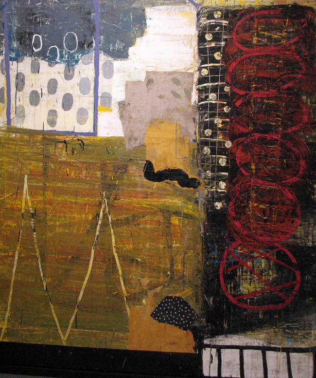
Scott Upton has had his work featured in film and television, with a history of exhibiting in Atlanta and the Southeast since the late 1970s. His almost meditative paintings elicit comparisons to Mark Rothko and JMW Turner’s late abstractions. As with those artists and more contemporary ones like artist Olafur Eliasson (who based a series of color experiments on Turner’s work), Upton agrees on the importance of luminosity: “For me, light is the unifying force, transforming everything it touches by banishing darkness and encouraging renewal.”  Upton explores an existential realm in these calm works, suggesting that in addition to the beauty”, light can offer feelings of hope and peace.

One is drawn in close to discover texture and layers of colors in the works that elude from a distance. Red flecks might appear in an underlayer, while the topmost layer seems to have been scraped and sanded down. Upton’s multiple layers of acrylic paint both conceal and reveal reflective silver and gold leaf through his proprietary varnish. I haven’t witnessed this with his work since I was only at the gallery during an afternoon, but during different times of day, the reflective properties might add to changes in hue. Although he claims to paint fairly quickly, the work demands contemplation and a break from the multitasking that is ubiquitous in most lives today.

Upton has a website showing his painting, with reviews from both Atlanta based art critic Jerry Cullum and Richard Maschal, author and retired arts and architecture critic for the Charlotte Observer.
Scott Upton received his BFA from the University of North Carolina and attended the Art Institute of Atlanta. He has exhibited at the Asheville Art Museum in North Carolina and the Art Institute of Atlanta. His work is in many collections, including the Knoxville (TN) Museum of Art, Four Seasons Hotel, Atlanta, the Arthur Blank Foundation in Atlanta, Northside Hospital of Atlanta and the Georgia Dome in Atlanta. He is also represented by Thomas Deans Fine Art in Atlanta.
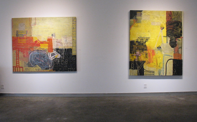
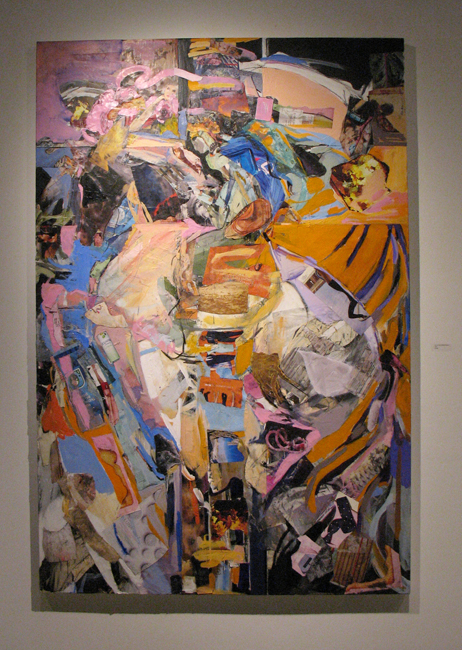
Daybreak_Mixedmedia48x72
Daybreak, mixed media on canvas 48×72 inches

DragonflywithFirefly1_mixedmedia_16x16
Dragonfly with Firefly1, mixed media on canvas 16×16 inches

FromtheEarth_mixedmedia48x36


From the Earth, mixed media on canvas 48×36 inches

Life'sPassion_Mixedmedia30x48
Life’s Passion, mixed media on canvas 30×48 inches

OffMyShoulders_mixedmedia_48x72
Off My Shoulders, mixed media on canvas 48×72 inches

RunwithIt_oil36x72
Run With It, oil on canvas 36×72 inches

StillLagoon_mixedmedia28x45
Still Lagoon, mixed media on canvas 28×45 inches

Thomas Deans Fine Art, 690 Miami Circle NE #905, Atlanta, GA 30324

T: 404 814-1811   F: 404 814-1812

Gallery Hours: Monday-Saturday, 11:00 a.m. – 5:00 p.m.

Posted in Art reviews, criticism and blogs | Tagged , , , , , , , , , , , , | 1 Comment