Rocio Rodriguez – Divergent Fictions at The Columbus Museum of Art

Last Saturday I caught the final weekend for the Rocio Rodriguez exhibit at the Columbus Museum of Art in Columbus, GA. I had never been to the space before and was pleasantly surprised. The painter had an exhibit at Sandler Hudson gallery in Atlanta earlier this year, but sadly I missed it. A 24 year retrospective in the third floor galleries, the show in Columbus included a selection of her works from 1988 to 2012.

The Command, 1988. Oil on canvas 84×91 inches. On loan from the High Museum of Art.

The Shield, 1991. Oil on canvas 84×80.5 inches.  Courtesy the artist.

Starting in the late 1980’s, the work during these decades spans several incarnations, including figurative, abstract and computer assisted work that relates to the Iraq war. The early works bring to mind Bay Area figurative artists like Manuel Neri and Nathan Oliveira.  Some of the grid making on paintings like “Time” echo those of Cy Twombly or Mark Tobey.

Time, 1995. Oil on canvas, 84×154 inches.  Courtesy the artist.

October 23, ’06, No.1. Pastel, oil pastel, pencil on paper.  Courtesy the artist.

Rodriguez seems to limit her palette to warm colors, with the exception of additions of pale blue in early works. One pastel from 2006 includes a deep ultramarine upper quadrant with what could be construed as stars in its half oval. Black, orange and red are predominant colors that she uses throughout.

Saffron Hands, 1994. Oil on canvas. On loan from David Joel.

In 1996 on a 3 month residency in Rome, Rodriguez began experimenting with decorative motifs, inspired by architecture and memories of her Cuban childhood. The museum brochure states that her work during this period rejected a “modernist attitude that was inclined to view beauty as a superficial concern.”

Roman Codex I, 1997. Oil on canvas, 77×84 inches. On loan from the New Orleans Museum of Art.

I especially like that Rodriguez is not shy about stating her stance in support of beauty, in opposition to what is an “acquired response in art circles.” She questions whether the beautiful can’t be provocative or engaging. She notes that she doesn’t “ascribe to absolutes, and my paintings don’t depend on theoretical positions but on the experiential.” 

In  1999 she returned to Italy and spent time working on pieces in which she deconstructed and rubbed out the subject matter.

Slit and Trace, 2002. Oil on canvas, 60×82 inches. On loan from David Joel.

From 2005 to 2009, Rodriguez developed a series based on photographs and maps of the Iraq war. Her palette concentrates on earth colors similar to those found in the desert; reds, ochres, dark browns, on what appeared to be raw canvas in some cases. The artist has said that the basis for using red in some of these works is the obvious symbolism for conflict, but her choices in color are normally intuitive and not contrived.

The Round City – Baghdad, 2007. Oil on canvas, 72×120 inches. Courtesy the artist.

Using her computer to upload her own drawings and photographs, she devised the basis for these large works. These do remind me of imagery generated by computers, especially beta versions of paint programs that I used in the 1990s when computer animation and automated rotoscoping tools were first being developed.

Rodriguez again shifted styles in the early 2000’s, returning to expressionist brushwork and reducing content. Some of these works combine media; pastel, pencil and oil or oil and acrylic.  In the latest paintings, she combines architectural elements with gesture and achieves emotional resonance through spare color combinations.

Orange Trace, 2012. Oil and acrylic on canvas, 72×78.5 inches.  Courtesy the artist.

Totem, 2011. Oil on canvas, 69.5×92.75 inches.  Courtesy the artist.

A review in Art in America can be found here. You can also view Rodriguez’s works in the High Museum’s permanent collection. Rodriguez’s website offers a conversation between the artist and critic and curator Lily Wei.


The museum also has a fairly good contemporary collection, if small, and a similar mix of Ashcan and American impressionist works. Slightly disconcerting are teaching moment blurbs next to the permanent works, describing the piece and offering a somewhat subjective analysis. As in Alice Neel’s ‘Swedish Girls’:

Louise Nevelson. Silence-Music 1, 1974-1982. Painted wood. Gift of Mrs. Richard Jennings by exchange.

Robert Motherwell. Massive Image, 1991, acrylic on canvas. Museum purchase made possible by various donations.

Ida Kohlmeyer. Passage #2, 1963. Gift of the artist.

More on the collection in my next post.

Posted in Art reviews, criticism and blogs, Daily meanderings | Tagged , , , , , , , , , , | 2 Comments

Taylor Means at Bill Lowe gallery

I know Taylor’s mom, Marghe Means, from the Avondale Arts Alliance board. The youngest artist that the Bill Lowe gallery represents, Means is currently in a three person show titled Unravel the Mystery, with Kathleen Morris and Barbara Brenner, up until early November. I went to the opening on October 12th and was stunned by the size of the place.  Another on my list of ‘to see’ galleries after a long haitus away from Atlanta, Lowe’s space is multi-roomed with huge ceilings and a balcony where an overflow of work was hung. Waitpersons, wine and food were on hand for guests.

Means is only 24, a 2011 graduate of the Maryland Institute College of Art, yet he’s been active in the Atlanta arts scene and has installed public works in various locales; a mural at Little Tree Studios where he has his own space, at the Eastern Shore where he painted an abandoned fishing boat, and in DC where  he’s been working with the Atlanta artist Alex Brewer (HENSE) on painting a church. Jerry Cullum, former senior editor of Arts Papers and an Atlanta arts critic and reviewer, wrote this piece after a recent studio visit with Means. There is a typo on the site, the date should be 2012, not 2007.

Means may be influenced by Basquiat and perhaps Egon Schiele, his loose drawings and pen and inks reminded me of Picasso’s etchings and drypoints. However, his sense of color is dynamic and sophisticated for an artist of any age. Yellow green interspersed with black and pale pink stripes is reminiscent of Vuillard’s and Matisse’s patterned interiors. Means uses red to an advantage in making a strong statement, but it never overwhelms the painting. His economy of color is refined and line and form come first.

A figurative painter who fully abstracts the human form, Means seems to be interested in content as a secondary theme to the work. Color serves as a symbolic and emotional way to read the paintings. There may be relationships between his characters, but my initial impression is that these are for the viewer to discover and interpret.

The artist hints at forms like flowers and structure within the frame, further obscuring whatever literal content can be derived. Stylistically, some pieces use Beardsley-esque figures in black that depict a kind of dark portent.

It will be fascinating to see how this artist progresses as he develops his body of work. I plan a studio visit soon and hope to report back.

Posted in Art reviews, criticism and blogs, Daily meanderings | Tagged , , , , , | 2 Comments

Thomas Deans Friends of a Social Network show and two other openings

“A Web of Artists: Friends of a Social Network” is the official title for one of the three openings that I went to last night at Thomas Deans Fine Art in Atlanta. Previously on Bennett Street, the gallery has moved to Miami Circle. It’s an intimate space and the gallery did a great job of hanging the artists’ work. Not all artists in the show are represented here, you’ll just have to visit the gallery. The show is up until October 13th.

Surprisingly, I knew four of the artists myself; Ken Kewley, Philip Koch, Paul Behnke and Harry Shooshinoff. Some I know from Facebook, others post in various blogs that I follow.

It was interesting to find a gallery culling from online for an exhibit and whose work the director may have never seen in person beforehand. Many of the artists are connected by residencies or teaching, or because they’ve found each other through social networks like Facebook.

I met Ken Kewley on Facebook and we share a history of living in Easton, PA. I first discovered his work through the 2010 notes he wrote about color on the blog Painting Perceptions. And I especially like that he uses a lot of greens, a color that one gallery director once advised me to change in my own work. He teaches art at PAFA, has taught at the Jerusalem Studio School Certosa program in Siena, Italy, and gives summer workshops in Michigan. I really enjoy his posts on FB about Braque and other artists. His three small figurative works of women in dressing rooms were just lovely. My camera isn’t so great in low light, so I’m including some work from Deans’ catalog and the artists’ websites as substitutes.

Ken Kewley. The Pink Skirt, oil on board, 10 x 5 inches, 2012.

Ken Kewley. The Light Gray Wrap, oil on board, 10 x 5 inches.

Ken Kewley. The Gray Skirt, oil on board, 10 x 5 inches.

Several of these artists show quite often, like the abstract colorist Paul Behnke, who is featured this month in Richard Rosenfeld’s august gallery in Philadelphia with a catalog write-up by critic and The Brooklyn Rail editor John Yau. I discovered Behnke from Brett Baker’s Painters’ Table blog and have been following his Structure and Imagery for a while. I’m impressed with how many exhibits he writes about and appreciate his bold sense of color. He lives in Brooklyn.

Paul Behnke. Little Je-Je, acrylic on canvas, 24 x 24 inches.

The next two paintings weren’t in the show, but Behnke graciously allowed some grabs off his site:

Paul Behnke. Vandervoort Place, acrylic on canvas 36 x 38 inches, 2012.

Paul Behnke. Orange Rampart, acrylic on canvas 48 x 46 inches, 2011.

Philip Koch, another painter whose blog and Facebook posts interest me, has exhibited widely and is greatly influenced by Edward Hopper. In fact, he’s painted in Hopper’s studio during the 14 residencies he’s spent in the S. Truro, MA residence. He paints from direct observation and memory, rather than from photographs. Koch is also one of the few painters I know, who acknowledges the Canadian Group of Seven, specifically Lawren Harris, as influences.

Philip Koch. Deep Forest Pool, oil on panel, 30 x 40 inches.

Philip Koch. The Birches of Maine, oil on panel, 15 x 20 inches.

Harry Shooshinoff is an amazingly prolific painter whose work I first discovered online. He lives a couple of hours north of Toronto in Ontario and paints the landscape that surrounds him. I love his small collages and paintings of snow covered fields and icy lakes that remind me of Nova Scotia, where I lived in the early 1970’s.

Harry Stooshinoff. Early August Green (Toward Tommy’s), acrylic on paper, 7.5 x 9 inches.

Harry Stooshinoff. Hedgerow (Overcast), acrylic on paper, 7.5 x 9.75 inches.

Harry Stooshinoff. Edge, torn acrylic collage on Arches paper, 7.75 x 6.25 inches. This was not in the show, I took it from one of his online sites to show his collage work.

Donald Beal, whose work reminds me of the Bay Area Figurative movement from the 1940s to the 1960s, teaches art at Dartmouth and talks about struggling with the figure in this video. Interestingly, he notes that although he’s competent enough to paint an anatomically correct hand, it didn’t work in an abstracted figurative piece – so he changed it. Like Behnke, who says he has no preconceived idea about color or form when he begins a painting, Beal discusses using tension and form to create a figurative work.

Donald Beal: Portrait of an Artist; Carol Pugliese producer from Provincetown Community TV on Vimeo.

Donald Beal. Seated Woman, charcoal and pastel, 23 x 18 inches.

Donald Beal. Inlet, oil on canvas, 20 x 24 inches.

Bill Gingles. Birth of Venus, acrylic on canvas, 24 x 32 inches, 2011.


Mitchell Johnson, South Carolina born and living now in Redwood City, CA, has had his paintings featured in many films. He first traveled to the Swedish island Gotland in 1989, and returned in 2008 to paint.

Mitchell Johnson. Gotland, oil on linen, 18 x 25 inches.


The next opening was up on E. Paces Ferry at the Alan Avery Art Company, showcasing two artists; Michele Mikesell and Gabriel Benzur. I was impressed with the posh spread, the gallery is in the heart of Buckhead and seems to be doing well. I spotted Jerry Cullum noshing. Trying to back out of the small lot afterwards, and not sideswipe the red Ferrari parked a tad too close to my pickup was one of my main concerns.

Sorry that I missed the August exhibit with Caio Fonseca.

The gallery showed abstract painter and collagist Sammy Peters‘ exuberant mixed media works in the front room.

Sammy Peters. Enigmatic: determinal; form, oil and mixed media on canvas, 30 x 40 inches.


Sammy Peters. Deferred: precise; solicitation, oil and mixed media on canvas, 12 x 12 inches.

Finally, I went over to Mason Murer Fine Art, where two old artist pals have been showing for years, Marc Chatov and Sidney Guberman. Figurative artist Suzy Schultz was one of the group featured last night, she has a studio around the corner over here in Avondale Estates, and offers watercolor workshops there. I had never been to the gallery before and at 24,000 square feet, it reminded me of the Phillips de Pury auction house in Chelsea, a gigantic arts warehouse. Overwhelming on first visit.


The gallery had a Purvis Young piece I covet.

Purvis Young. Untitled, mixed media on wood, 56 x 96 inches.

Coming up in early October is the Westobou festival if you find yourself in Augusta. Many performances and events like the visual arts project are free to the public.

Posted in Art reviews, criticism and blogs, Daily meanderings | Tagged , , , , , , , , , , , , | 8 Comments

SeekATL, studio visit with artist Brian Dettmer

The latest SeekATL visit this past Saturday was held at Brian Dettmer’s studio and house in Doraville. Some of those in attendance suggested that while having a studio in house offers a more personalized view of his/her lifestyle, that glimpse isn’t usually relevant to the work and could serve to distract. I enjoy being in areas that I would otherwise never visit, and don’t expect the space to define the artist’s production. Dettmer’s neighborhood just north of the city is dotted with circa 1960s mid century modern ranches and his narrow, light filled studio/entry room reminded me of my own studio, once a back porch.

I had read about Brian’s book art in a New Yorker article last year and was intrigued. It was great to finally meet him and see his work in progress. The totem below is being prepared to be cut into.

Originally from Chicago, Dettmer has been carving into Encyclopedia Brittanicas and other books that pre-date 1970, since he stopped painting almost a decade ago. He suggests that the physical form of information is becoming a thing of the past and in his statement says that “material and history are being lost, slipping and eroding into the ether. Newer media swiftly flips forms, unrestricted by the weight of material and the responsibility of history.”

Dettmer works as a kind of archaeologist, not knowing what might be found as he cuts into the books. He notes that there is an interaction between himself and what has been communicated in the pages. His work is fascinating, but any book collector might argue that the form itself is worth preserving. The philosopher and critical theorist Walter Benjamin, a book collector, said that “one of the finest memories of a collector is the moment when he rescued a book to which he might never have given a thought, much less a wishful look, because he found it lonely and abandoned on the marketplace and bought it to give it its freedom- the way the prince bought a beautiful slave girl in ‘The Arabian Nights’….To a book collector, you see, the true freedom of all books is somewhere on his shelves.”

Dettmer hasn’t had to take a day job in some time and his bookshelf is dotted with books he’s been in, one of his works graces the cover of Book Art, Iconic Sculptures and Installations Made from Books, published by Gestalten Press. He uses mostly  non-fiction books and admitted as a reader he wasn’t much interested in fiction, although the transformation of burned Danielle Steel paperbacks into a sculpture in the form of a door might suggest otherwise.

In this interview with Gestalten.tv, Dettmer talks about his process and what books may mean in an age of increasingly rapid information and data transfer.

Dettmer’s solo show Elemental, at MocaGA, opens on October 20th. His new flag motifs will be displayed, along with a triptych reminiscent of early pixelated computer graphics. His background as an animator seems to have influenced some of the work.

A totem standing in the living-room.

Early work with a figurative theme.

Be sure to check out his website for more amazing work.

Posted in Art reviews, criticism and blogs, Daily meanderings | Tagged , , , , , , | Leave a comment

Summer Salon at Get This Gallery!

This past Saturday I stopped in at two galleries that have been going strong in Atlanta since after I left town in the late 90s; Get This! and Saltworks next door.  Saltworks is relocating. The director Brian Holcombe told me he may evolve more of their focus on art fairs and with an online presence. I didn’t take any photos there, but visit the site for more information.

The last day for the Summer Salon group show was featured at Get This!, with six artists’ work on three walls. Lloyd Benjamin was in house to describe one of his visions for the exhibit – to have a view of the smallish works within the gallery space from one vantage point.

Benjamin noted certain parallels in placing say, Atlanta based artist Gyun Hur’s reworked striped found photographs, next to Andy Moon’s densely patterned pieces and mandalas – both have Korean influences. The stripes in Hur’s case may reference her mother’s traditional wedding blanket, noted in her prior installations.

Gyun Hur. Untitled (Diptych). 2010, acrylic on found paper, 20 x 11 inches.

Andy Moon. Untitled. 2010, mixed media on paper, 10 x 10 inches.

Moon has been a professional textile designer and cites the abstract symbolist painter Simon Gouverneur (1934-1990) as an influence.

Many of the works on paper were tacked to the wall, without frames. The lack of mounting did not detract from the thoughtfulness and delicacy of the work that lingered long after my time there. Often, group shows with a surfeit of work allow for little breathing room, but this small exhibit succeeds brilliantly by limiting the space and the number of pieces; the jewel like watercolors, pen and inks and gouaches hold their own.

Dawn Black. Back From the Market. 2012, gouache, watercolor and ink on paper, 19 x 14.25 inches.

Dawn Black. Look What We Found. 2012, gouache, watercolor and ink on paper, 13 x 18 inches.

A few works reminded me of a more surrealist Ben Shahn or Saul Steinberg. In the same tradition of political satire, some of these artists seem to be making a subtle (or not so subtle) point about feminism, society and materialism.

Jill Storthz. Glass Palace. 2007, ink and colored pencil on paper, 22 x 24 inches.

Jill Storthz. Lantern. 2010, ink and colored pencil on paper, 14 x 17 inches.

Harrison Keys. Untitled. 2012, watercolor, pen and pencil on paper, 7 x 10 inches.


As a former printmaker, the standouts for me were the musician and artist Rick Froberg’s black and white etchings. The linework in his Cockroach, Rat, and Scorpion is slightly reminiscent of Arthur Rackham or Don Marquis’s Archy and Mehitabel comic strip. However, Froberg’s etchings offer more acerbic commentary, closer to Daumier or Goya in its darkness and sardonic humor.

Rick Froberg. Cockroach,  Rat and Scorpion. 1996, etching, 8.75 x 10.5 inches

Rick Froberg. Untitled. 1996, etching, 8.5 x 10.5 inches

Rick Froberg. Untitled. 1995, etching. (sold)

In contrast to shows that might remind one of Sharon Butler’s article last summer in the Brooklyn Rail in which she discusses the ‘New Casualists’, these artists seem to be going in the opposite direction of abstraction; that of deliberately intricate pattern and constructed symbolism. Whether drawn from personal experience and mythology, or from politically charged ideologies, the work is expressive and detailed.

Get This! features the San Francisco based artist Ben Venom in an opening this coming Saturday, August 25th, his first solo exhibit at the gallery:

“Ben Venom’s practice is one of extreme juxtaposition. The Atlanta native combines the unexpected tradition of handmade crafts and the historical art of quilting with a musical genre that has a rich history in its own right, Heavy Metal.”


Posted in Art reviews, criticism and blogs, Daily meanderings | Tagged , , , , , , , , , , , , , , , | Leave a comment

Interview with Ryan Coleman

I visited Ryan’s airy studio near Atlantic Station at the end of July. His spends all day painting, arriving around nine in the morning and leaving at five-ish. After spending over eight years as an assistant to Jeff Koons, I’m not surprised at his discipline. Even more impressive, the day I made the appointment to visit was his birthday.

We chatted while I took photos of his studio and work, and he sent me his own photos to round out the interview. I coveted a few of his prized books – one on Cy Twombly and a present from his wife, Vitamin P2, a book of new contemporary painting published by Phaidon. Coleman grew up with creative parents; his dad Steve Coleman worked for Disney in LA and his mother has worked in interior design.

In his statement Coleman notes that a diverse set of elements informs his work; cartoons, historical references to art, graffiti – and many of these are evident in the postcards and clippings tacked to a wall in the studio.

After eight years in Brooklyn, Coleman moved back with his wife to Atlanta in 2011 and has been showing at various galleries around the city. He shows at Pryor Fine Art and was recently in a group exhibit at Poem88.

The following interview is compiled from questions written before the visit, my notes during our meeting and from Ryan’s thoughtful written responses.

VW What led you to become a painter?

RC  I’ve always been creative as long as I can remember, and it was encouraged from both sides of my family. My mom was an interior designer, and my dad a cartoonist (both are semi-retired). Though separated when I was young, I was exposed and greatly influenced by both of their creativity. My mom always encouraged being creative because she was so much herself, finding unique ways to decorate our home, and working on projects constantly.

My dad inked a comic strip when I was young, and I would watch him work, and was fascinated by the sharp, crisp line he would make with a brush and ink.

He was also extremely passionate about animation and had tons of animation books lying around. So art was always there, but it wasn’t really until high school where I knew I wanted to be a painter from then on out.

VW  Can you describe how NY or Atlanta has influenced your work? Talk a little about working in Brooklyn and your time as an assistant to Jeff Koons. Your work is so different in that you’re an actual painter and not doing conceptual work.

RC  I grew up in Jacksonville, Florida where I attended Douglas Anderson School of the Arts, a magnet school. In 1996 I was accepted into the Atlanta College of Art, and coming to Atlanta from Jacksonville was extremely exciting for me at the time. There was a great arts scene going on. Atlanta for me was really a jumping point, and an introduction to the greater art world. My junior year at ACA, I was accepted into a studio program called the New York Residency Program, and went to live in NYC for a semester in 1999.

This changed and matured me in so many ways, and I knew immediately that I needed/wanted to move to New York City. You hear it all the time, but there really is nowhere else in the world like it, especially for art. The museums, the galleries, the city itself, is massive and bursting with energy. It affects you big time. I came back to Atlanta, finished up my BFA, freelanced briefly doing animation for Cartoon Network and had my mind set on moving to New York.

Untitled (Surprised by Joy), oil on paper, 22×30″, 2012

The opportunity came shortly after my good friend, Todd Wahnish, asked if I wanted to move with him, and I excitedly took it (this was 2003). For the next 8 1/2 years, I immersed myself in the city; going to shows, making art, and working full time as an assistant to Jeff Koons. This was one of those life changing experiences – working with a wonderful and talented group of people, and being part of something so large and exciting. Seeing and experiencing how an artist on that scale operates was amazing. It entailed a lot of problem solving and working as a collective to execute Jeff’s vision.

You’re mostly focusing on the production of the material and paying extreme attention to detail, with 100 or so other people with similar interests. The drawback of working full-time anywhere is the amount of time you sacrifice on your own work, and between that and going out, it leaves a small window of time to produce your own work.

Untitled, (detail) oil on paper, 22×30″, 2012

In early 2011, my wife and I decided to move back to Atlanta to take a bit of a break from the city and focus on our own thing. Fortunately, I’ve been able to devote most of my schedule to my own work, and I’m excited to participate in the art scene here. That was a very long answer to a short question… Both have had positive influences on me and my art, in different ways.

 on the right – Untitled (Jungle), oil on canvas 40×48″, 2012.

VW Describe your daily painting/working routine and what inspires your paintings? Do you make sketches or draw on a regular basis?

RC  To sum up the things that inspire me in painting are: art history, evoking a mood or emotion in the work, and elements of cartoons and graffiti art. I’m equally fascinated with the illusion of depth and narrative you’ll find in pre-Modernist painting, the immediacy and impact you find in Abstract Expressionism, and the color and pop of animation and street art. My overall mission as a painter has been to portray a little of each in my work. I’m also inspired by the sublime and optimism. I do make sketches and draw on a regular basis.

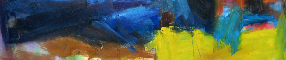
Detail from Untitled, oil on canvas 40×48″, 2012.

VW  I see a little Pat Steir in some of the larger pieces and a sort of Japanese calligraphy in the smaller works on paper. The dynamic and motion in the work almost reminds me of cell animation, an abstraction of movement. Can you talk about the context of your work and any ideologies you may have as an artist?

RC  I think the context is trying to incorporate an acknowledgement of where painting has been, where it has come from, and where it is now. I tend to lean toward abstraction and obscuring the subject matter or imagery into something which contains a shroud of mystery. I’m drawn to work that has a bit of this mystery in it, and one artist in particular who comes to mind in regard to this is J.M.W. Turner. I saw an exhibition of his a few years ago at the Metropolitan Museum in New York, and was deeply moved by his paintings. I was also struck by the size and commanding presence they emit, and that they teeter between abstraction and representation.

Untitled (Heaven & Earth), oil on canvas, 40×48″, 2012

VW Which artists have had the most influence on your work? And are there current painters whose work excites you?

RC  Very much so… I’ll try and keep this short (the list is long): Leonardo da Vinci, Peter Paul Reubens, Corot, Monet, Picasso, John Singer Sargent, Cy Twombly, Robert Rauschenberg, Jean-Michel Basquiat, James Turrell, Vernon Grant, Cecily Brown, Inka Essenhigh, Takashi Murakami, Os Gemeos, Kristine Moran.

VW  Some artists suggest that the studio is too private for them, that they require a social forum for their work. Does networking with other artists and developing community have much bearing on your life as an artist and if so, how does it inform your work and process?

RC  I enjoy both the privacy of working in my own studio, and networking and socializing with other artists. For me it goes hand in hand.

Phoenix, oil on paper 22×30″, 2012.

VW  I’m always curious about how painters are utilizing social networking. I know painters who have been successful marketing their work online, even while they’re represented by a gallery. Have you explored some of these or other alternative ways to either exhibit or sell your work?

RC  Yes. It’s amazing how these days you can share your work with someone half way around the world in real time. I’ve done commissions and sold work both domestically and internationally – all through online communication. It’s a real thrill to get an e-mail from someone that you’ve never met who’s interested or moved by your work.

VW  This next question may dovetail with the previous one; are you able to make a living solely from your painting, or do you work a ‘day’ job?

RC  I have several avenues I utilize to make a living with my work, with some being more glamorous than others. I feel extremely fortunate though, to be able to work in my studio full-time. Of course, the best is when a work sells for what it is, it’s really an amazing feeling. I’ve done portraits, unique commissions/installations, and am about to begin work on two very large graffiti-styled backdrops for a private event. I’ve also been developing an online shop for my more illustrative/cartoony work, which I hope to launch soon.

VW  Any immediate plans for exhibits and/or the next series of work?

RC  I just participated in group shows at Poem88 & Pryor, and an event at Site95 in Brooklyn, NY. I’m currently working on a new body of work which I’ll be posting on my website and blog soon. I’m looking to expand showing opportunities locally and beyond!


You can view Ryan Coleman’s work online at his website, follow him on Twitter and Tumblr.


Posted in Daily meanderings, Interviews | Tagged , , , , , , , , , | Leave a comment

Serenbe, an eco-development

Took an interesting road trip this past Saturday with my sister, Gina, to Serenbe, a planned community about an hour south of Atlanta near Palmetto. It looked like an easy drive, until we missed the very first exit on the directions. Ending up in Newnan, it was a bit of a backtrack from overshooting the route – but we finally found the compound, thanks to phone directions from the Hill’s desk person.

Steve Nygren, a local entrepreneur who made his fame and fortune with the Pleasant Peasant restaurant chain, is the visionary behind Serenbe. He and his wife bought the first 60 acres in 1991 and have developed with a focus on environmentally sound practices and the preservation of 70% green space while they added 40,000 more acres over the years. A good history of their work and the resulting Chattahoochee Hill Country Community Plan can be found here and the master plan concepts here.

I wanted to see the community and Gina needed corn from the organic farmers market – produce from Serenbe Farms. We made it just before it closed at noon.

Steve Nygren was walking towards us while we hit the Farmers Market.

Next on our list was lunch at The Hill restaurant. One pizza, one flatbread w/smoked salmon & fresh greens. Fresh blueberry pie for dessert.

Gina with her crispy pizza.

We ended up having a nice chat with Nygren at lunch. He was kind enough to draw directions back to Atlanta on our paper tablecloth.

The entire village is friendly and has an upscale eclectic feel in its design and layout – reminiscent of some small towns in southeastern PA, where I last lived near Philly. A recycled door to townhouses or condominiums could just as easily be found in the Westside arts district of Atlanta.

Atlanta’s own supreme garden designer and philosopher, expert on old flowers and passionate visionary for all things green, Ryan Gainey, worked on the landscaping for the community and has been retained as the horticultural advisor.

Cottage-y looking certified Earthcraft houses with no front lawns allowed! No noisy lawnmowers or leafblowers = fewer emissions. Water comes from the city of Atlanta and while there is plenty of landscaping, much of it is geared towards low maintenance.

I hadn’t expected the  zero-energy Bosch house to be so designer focused, but it was lovely to tour. I readily admit to a lack of interest in decorative accents, so you can review Southern Hospitality’s wonderful blog post for the look.

Equipped with a geothermal heat pump, solar panels on the roof, an electric heat pump water heater and Toto toilets and sinks, Bosch’s first zero-energy house in the US  is just that: highly energy efficient and designed to sell back excess energy to GA Power.  An AJC journalist recently produced a good article about geothermal energy and the house. Hardwood floors look like reclaimed wood, but come from managed forest resources and certified by the Forest Stewardship  Council.

I was taken with the Bosch smaller footprint washer/dryer and their accompanying enclosure. And that drying rack, set in the wall next to the appliances, is a marvel of old fashioned design. I want one.

We missed touring the HGTV Green Home, but you can read about it here.

This video shows Nygren talking about Serenbe and some shots of the community. A Flickr set shows more downtown architecture and some of the surrounding land.

And Terry Kearns has another fantastic architectural overview and video of Steve Nygren’s ‘Artist Talk’ at his blog, Architecture Tourist, here.

Finally, the New York Times has a great write-up from 2009 here. Well worth the drive, don’t miss the exit for South Fulton Parkway just past the Atlanta airport!


Posted in Daily meanderings, Local Farms | Tagged , , , , , , , , , , , , , , | 2 Comments

Folding: anticipatory, routine, closure, by Nicole Livieratos

There can be a purity of purpose in dance and choreography can cross over into conceptual art. The mystery of unanswered or open-ended questions about meaning, doesn’t detract from the force of the performance. I saw this on Saturday, June 23rd, when I attended “Folding”, Nicole Livieratos‘ three person, three hour draft performance in MocaGA’s lobby. Notes pinned up to the far wall of the atrium spelled out subtext of the show’s title: “Anticipatory, Routine, Closure”. The three performers included Celeste Miller, Erin Weller Dalton, and Kim Kleiber. Miller is well known locally and has directed the Choreographer’s Lab at Jacob’s Pillow Dance Festival since 1995.

My notes are cryptic:

folding can be seen as multi-tasking or merging one thing into the next
everyone has unfinished business
grounded, weighted to floor

This was a leisurely performance. The dancers went about their task of folding slowly, deliberately. At different intervals, one dancer might turn and look at another and motion stopped for a minute. At other times, a performer raised her arm as if to stretch or to mark her space. Suitcases waited in the wings – as they were filled, the performers rolled them off ‘stage’ or near the back wall.

The audience sat on the floor and in chairs along one side of the space. Being eye level with the mass of donated clothes stacked or folded enabled a more intimate interaction with the performers. The loud snap of the sheet being folded by two dancers was startling, when so close.

I was reminded of the painters who have used women in their work not merely as icons of beauty, but to comment about their era. Degas was famous for his ballet dancers, yet his depictions of French laundresses always got to me.

The Laundress. Oil on canvas 25.1 x 19.4cm. Edgar Degas, 1873. Norton Simon Art Foundation, Pasadena, CA.

Women Ironing. Oil on canvas 76 x 81.5cm. Edgar Degas, circa 1884-1886. Musée d’Orsay, Paris.

These are paintings of women who are yawning from fatigue, bent over hot irons with masses of white linen spread out on tables or hanging nearby. They slave away, washing and pressing the dirty clothes of a class far above their own. They are the paintings of a master who in the late 1800’s presented women’s labor and the singular class structure of Paris. His friend, Emile Zola, had published L’Assommoir in 1877, describing an urban laundry and the misery of the Parisian poor. Whether Degas’ intent was reflective of the naturalist and social concerns of his day or simply to depict the poetry he saw, we’ll never know.

While Livieratos isn’t strictly concerned with women’s work either – she wanted to have at least one man in the mix but couldn’t get one – she did admit that her act of folding clothes could be seen through a feminist lens. Every mother teaches her daughter to fold. Not all, myself included, readily pick up the skill.

Towards the end, all three women sat in chairs facing away from the audience and posed without moving. An arm was casually draped behind the chair or a head cradled in an elbow – as if to suggest a break in the rhythm of the task or maybe, finality.

In the action of folding as performance, many layers of meaning can be found. I return to my cryptic notes. This gentle and universal act may show the contrast between the daily bombardment of information in our lives, and a mundane and routine task. Anticipating the result of folding might be seen as order.  The metaphor of suitcases could signify closure or moving on. Folding in – is it an addition or a loss – and what does it mean to integrate finality (mortality?) into an ongoing and complex life?

The commonality of the act, forgetting gender, is what Livieratos seems to be after. She said that she wants the piece to be read on several levels; clothing as a covering for the body in transition, disorder and order, a rhythm in brief and fleeting moments and the harmony formed when we connect with each other, or what happens when we don’t.

Reactions from the audience became a part of the performance. Some of us were moved to laughter when the piles of folded clothes fell off a card table and a dancer shrugged. Others were moved to tears.

Most of the audience remained for the duration, and offered feedback and questions during Nicole’s Q&A. Livieratos said that she was intrigued by the thought of extending the timeframe of the piece to longer than a few hours. She also wants to add a video element. There was an ambient soundtrack of backyard noises like birds, the family dog Emmie-Lou barking and at one point, a plane could be heard overhead.

In an email after the performance, Livieratos said that she had been “thinking a lot about the question of weight and ground. Both in the more literal and in the more abstract.  Feeling like there is a groundedness to the activity, a natural release as things fall and either must be left, tucked under other things, walked past, treaded on, picked up and re-folded…. the element of choice enters.  Interesting to me too, how if that weight gets too related to the performers in their execution, it becomes so grim, so heavy.  That’s what happened some on Friday- as the performers got tired, the weight of it all seemed so insurmountable.  Not that we don’t all feel that at times, but I also want the audience to find the release, the humor in the action and the weight, and the potential for freedom and lightness.”

Do we ever truly get a choice in our own lives or is there a constant randomness, like the clothes that were donated for this piece and the individual articles of clothing that each performer chose to pick up and fold? With a body of work that is consistently challenging, Ms. Livieratos remains open to change and said she will be finessing her ideas about sound and scale for this piece, and where the next performance might occur.

Posted in Art reviews, criticism and blogs, Daily meanderings | Tagged , , , , , , , | Leave a comment

Small paintings

New work from spring and early summer. All of these are small paintings, acrylic or oil on masonite or canvas panels. Available in my eshop here.

Orange Square. Oil on masonite 8″x8″, 2012.

Red Landscape. Acylic on canvas panel 10″x8″, 2012.

Breathe. Acrylic on masonite 9″x12″, 2012.

Fields of Memory. Acrylic on masonite 9″x12″, 2012.

Strybing Cypress. Oil on masonite 12″x12.5″, 2012.

and a studio shot.

Posted in Daily meanderings, New Work, Paintings | Tagged , , , , , , , , , | 2 Comments

Bernd Hausmann at Emily Amy Gallery

On May 19th, Atlanta’s Emily Amy Gallery hosted an artist’s talk by German-born Bernd Hausmann, a Boston based painter having his first solo exhibition at the westside arts district gallery, through July 7th.

The gallery’s blurb states: “The show title, Darwin’s Coral, is a reference both to the broader concept of evolution and the natural world that is so critical to Haussmann’s work and process as well as to the more blatant patterns that often appear in this new series. In addition to the new collection of paintings that will be on view, there will also be several short films broadcast during the show that will allude to the elusive yet familiar natural world.”

The unique placement of the untitled work is a collaboration between gallerist and artist. Although each is to be perceived on its own, Bernd said that he was interested in what would happen when connecting the large and small works, and how the colors would inform one another. The small paintings work as more intensely chromatic reflections of the larger pieces. Even so, Hausmann says he never paints for the space, or for an exhibit.

Hausmann divides his time between Boston and rural Maine and many of these works have to do with water and, of course, coral. He says that a particular place makes the artist change or alter his personal environment and engage with the outside world.

Like so many contemporary artists who deal with landscape, there is a veiled political message in these environmentally focused paintings. Sixty percent of the world’s coral reefs are in trouble; global warming is raising water temperatures and increased CO2 is adding more acidity to the waters.

Hausmann notes that a biological or spiritual attraction to place may be the genesis of the artist’s curiosity, but the difficulty of being grounded results in attaching one’s self to the land, whether we till the soil or paint it.

This series on coral emerged from a series he was doing on mountains and oceans. By layering information in the paintings, through his use of scraping and reworking thickly textured areas, he is alluding to the evolution of ideas and a new theory about how coral replicates itself. Darwin originally formulated a sound theory about the structure and formation of coral, before ever setting foot on a reef.

Close-up.

The single celled algae that live inside the new coral provide it with food, and as the coral grows, the polyp divides repeatedly and produces more skeleton. Continually adding onto the next layer, each subsequent generation of coral builds up the reef on the bones of its ancestors. Because so many variables contribute to the formation of the coral’s shape, identification of exact types is difficult. The newer science claims that glacial effects cause sea level changes and that plate tectonics have a role in ocean floor changes.

Hausmann’s silvery paintings are unique – and reminiscent of lichen on rocks if you happened upon them during a full moonlit night. Depending on time of day or the lighting, these highly reflective works will change in hue. The mutations toward either blues or pinks are startling even in their subtlety.

Hausmann mentioned that very little in two dimensional painting has the ability to change, although we might consider Monet’s series of about thirty haystacks that he painted throughout a six month period. The same thematic repetition to show differences in light was in play, with resulting success.

In these shimmering works, Hausmann references the surface of water as a mirror. When one focuses on the bottom of the ocean, the top level information is lost. If we suspend our perception and then refocus on the surface, the converse is true. The shifting of information seems to be both his literal and philosophical point, about how memory informs and repetition influences memory.

The boundaries of his art, as he says, are influenced by his environment. Hausmann suggests that being authentic is a difficult endeavor for any artist, it will be intriguing to see the progression of this work.

More about Bernd Hausmann here.


Posted in Art reviews, criticism and blogs, Daily meanderings | Tagged , , , , , , , , , , , , | 4 Comments